Case Study
Yangzheng Kindergarten Support Program ——
Love Tuition
Designed a donation platform to support kindergarten tuition for children in Gansu, China — covering donation flows, story-driven content, and trust-building mechanisms — increasing engagement and donation completion rates in internal trials.
UIUX Design
Empathy-led Design
On-site Research
Storytelling
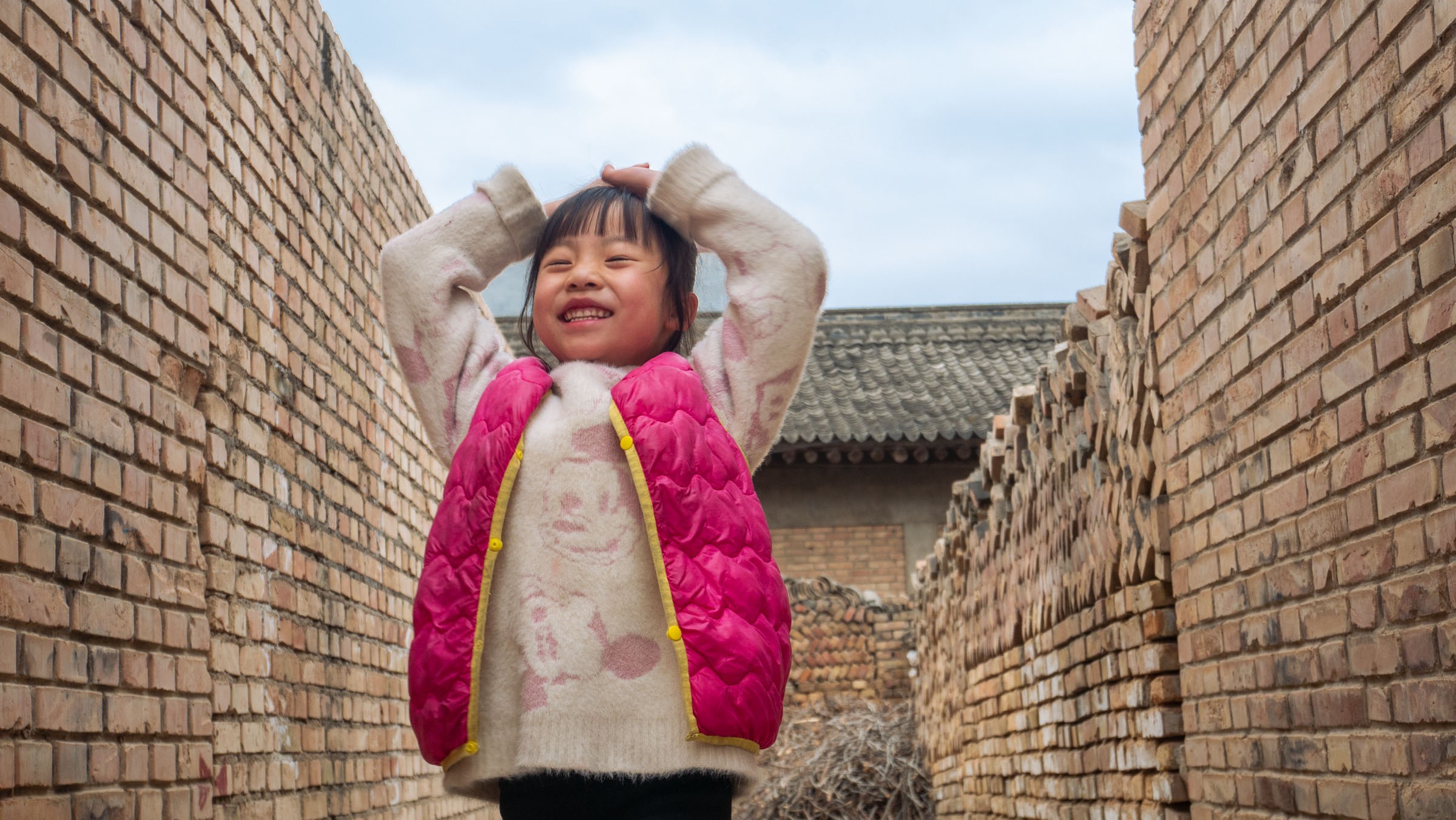
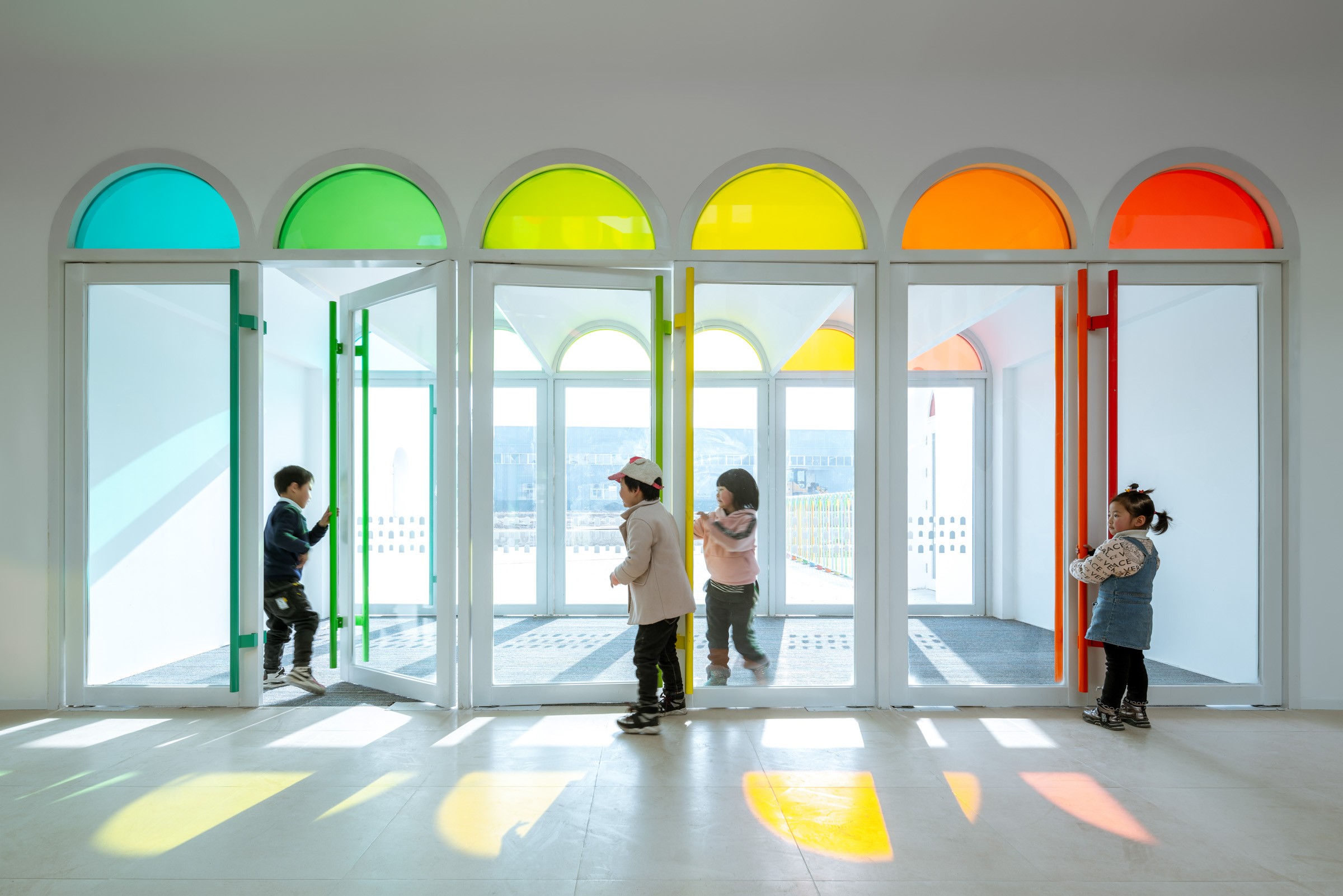
Picture taken in Gansu Province, China. copyright: Oufei Zhao
OverView & Role
This project began as an internal platform for employees at my company to sponsor children in a rural kindergarten in Gansu, China. Each child’s story was carefully documented through interviews and photographs, allowing employees to read, connect, and choose who to support.
Rather than traditional charity websites, this platform emphasizes emotional connection, transparency, and trust. Each donation covers tuition, uniforms, meals, and insurance for a full semester.
While this was initially launched as a company-wide experiment, our long-term goal is to open the platform to the public, creating a scalable system for meaningful, story-led giving.
My Role: UX & UI Designer, Visual Storyteller, Researcher
Beyond the platform, I also designed graduation booklets, medals, and even handmade plant tags for the children. This project became more than just work—it was a personal journey of care, connection, and gratitude.
Movie taken in Gansu Province, China. copyright: Huayang Song
Design Objective
Encourage individual employees to complete donations through a simple, trustworthy, and emotionally resonant experience.
We didn’t just want to make a donation system. We wanted to design a way for our colleagues to meet these children — as humans, not numbers. And we hoped that by making it easy to care, we could make it easier to act.
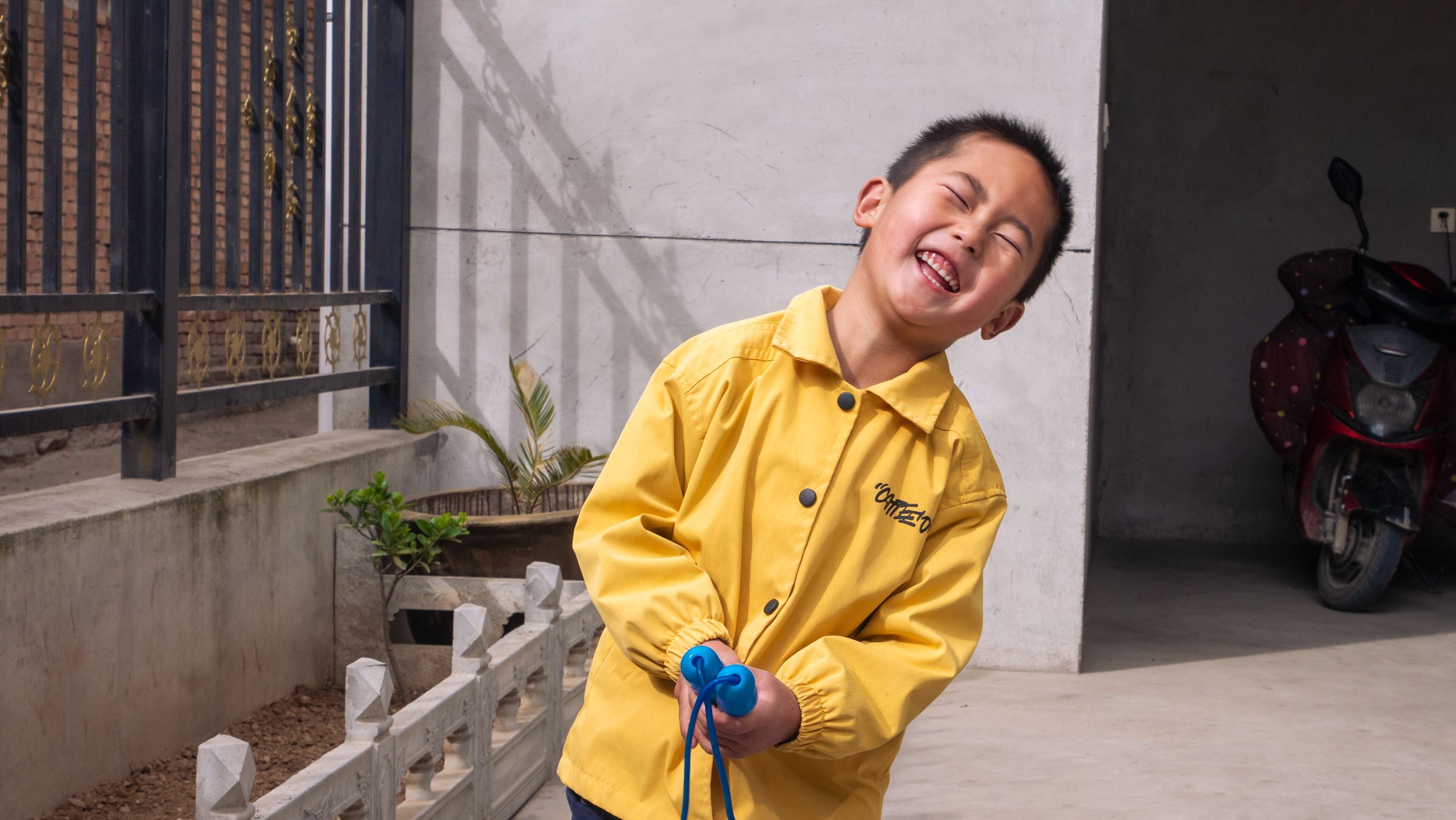
Pictures taken in Gansu Province, China. copyright: Oufei Zhao
Research & Insight
To ensure the platform responded to real user needs, we conducted dual-focus research:
① Interviews with the Children & Their Families
We visited rural homes and the kindergarten in Gansu, interviewing the children and their caregivers. Their stories formed the emotional core of the platform — each profile is based on a real life, not a persona.
Many children live with grandparents, often in modest homes far from medical or educational resources. Every photo and quote was carefully curated with consent and dignity.
② Feedback from Our Company’s Employees (Internal Donors)
Since this was an internal pilot, we collected feedback through casual conversations, a quick survey, and donation session observations.
Key takeaways:
- Emotional clarity matters. Employees wanted to feel confident that their donation really made a difference. Real stories helped unlock empathy.
- They needed simplicity. Most users only had a few minutes to engage. A clear 2–3 step donation flow was essential.
- Photo s over numbers. Team members responded much more strongly to children’s photos and quotes than to funding stats.
"I chose the child because of her photo. She reminded me of my niece." — a colleague after completing his donation
People donate not just because they believe in a cause
— but because they recognize a face, a story, a connection.
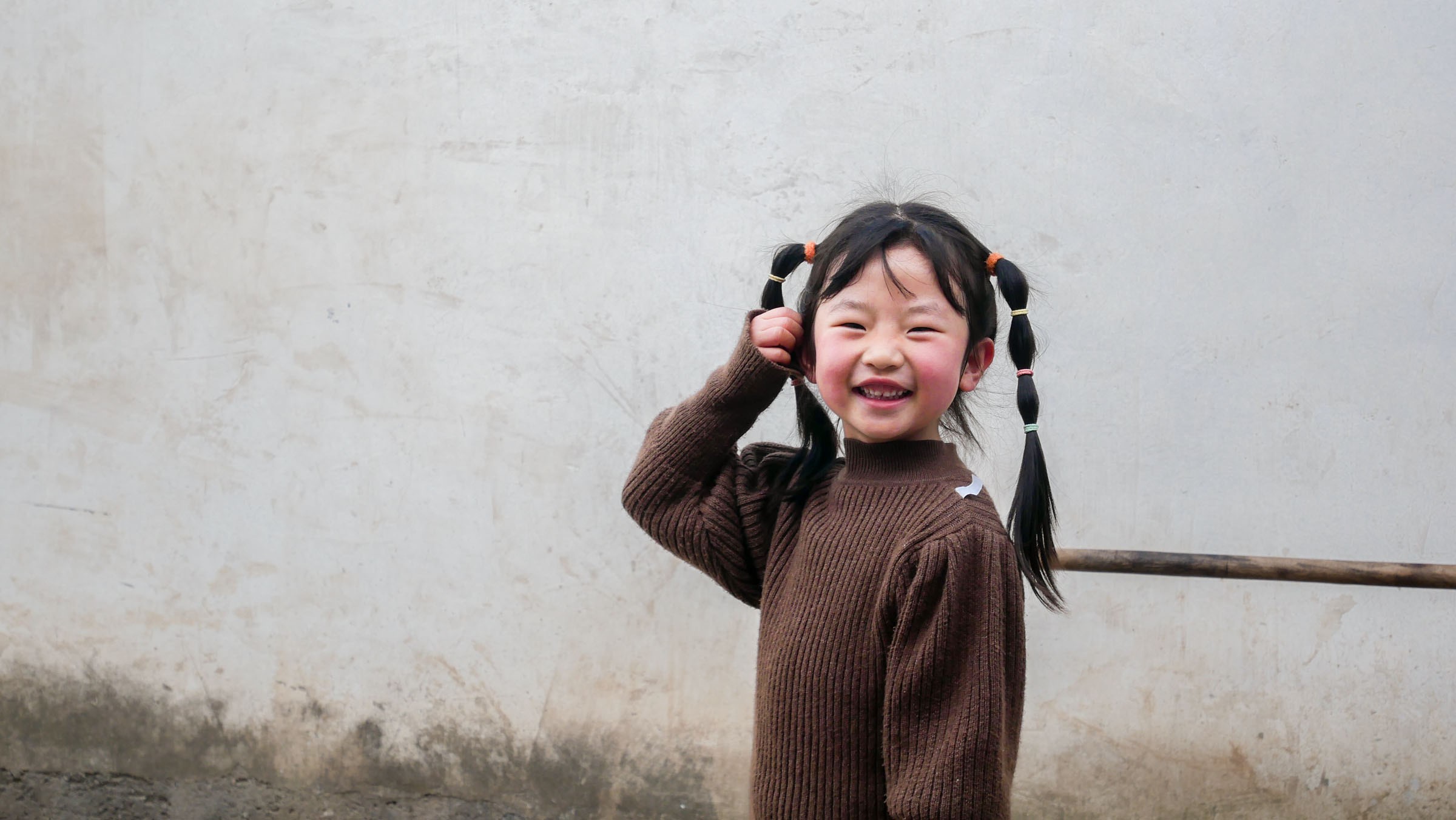
Pictures taken in Gansu Province, China. copyright: Oufei Zhao
To address the information overload, I worked closely with the ESG team to prioritize and segment the data, ensuring that different user groups could find what they needed without friction.
To manage interface complexity, I created a feature-to-user mapping matrix to understand which functions were relevant to each user group. This helped prioritize content hierarchies and screen layout, ensuring the most frequently accessed modules were surfaced clearly.
Given the interface is displayed on a large touchscreen, special attention was paid to interaction distance, tap targets, and layout rhythm to ensure an accessible and fluid touch experience.
User Journey Overview
Design Process
ーInformation Architecture
To stay true to our sustainability narrative, the concept of “zero carbon” informed not just content but layout and emphasis. We designed the data experience to reflect the building’s dynamic energy flow — balancing energy production and consumption as a living system.
This became the entry point of the interface:A real-time comparison of energy production vs energy consumption on the homepage.
As a storyteller, this offers a clear and compelling hook — a way to immediately ground users in the core idea before inviting them to explore deeper layers of sustainability data.
I conducted informal interviews and feedback sessions with instructors, library staff, and general visitors. These sessions helped clarify pain points and led to clearer, more intuitive content grouping, as well as the addition of narrative layers for public education.
The final interface is structured across three levels of depth:
- Level 1 (Homepage Loop): Key highlights shown in a looping carousel — energy summary, environment conditions, and a library feature (e.g., book recommendations).
- Level 2 (Category View): Topic-based dashboards for deeper exploration — electricity, water, carbon, etc.
- Level 3 (Historical Detail): Time-series data, zone comparisons, and granular usage patterns for expert use.
For presenters and docents, we created special narrative modules including animated power flow diagrams (live Electricity). These help explain the dynamic supply-demand relationship in the zero-carbon system, offering a storytelling layer on top of the data.
Key Screens & Design Decisions
This project was developed in close collaboration with a non-profit foundation team and our in-house frontend engineers. From the start, the goal wasn’t just to “build a donation platform” — it was to create a space where donors could feel an emotional connection with real children in need.
During Phase I, we focused on the core donation flow:
- Working closely with the foundation team, we conducted interviews and home visits to gather real stories from children in Gansu, China.
- Every image, quote, and donation figure was carefully selected to reflect dignity and clarity — The donation amounts (¥200–¥3750) were deliberately chosen to guide decisions: ¥3750, the full tuition package, was pre-selected to gently nudge full sponsorships, while smaller options offered flexibility.
- Micro-copy (button text, confirmation notes) was rewritten multiple times to carry emotional tone without overwhelming the user.
During Phase II, we introduced new features and refinements:
- A semi-anonymous donation record page was added to increase visibility and encourage internal participation. This led to a measurable +33% increase in engagement.
- We redesigned the “My Page” dashboard to offer donors certificates, messages from children, and a space to revisit their contributions.
Throughout both phases, I worked hand-in-hand with frontend developers to ensure layout responsiveness, image compression (due to rural upload constraints), and optimized rendering across browsers. Many UI decisions came from real-time testing with internal employees — including the placement of donation buttons, hover tooltips, and even the softness of typeface.
Key Screens & Design Highlights
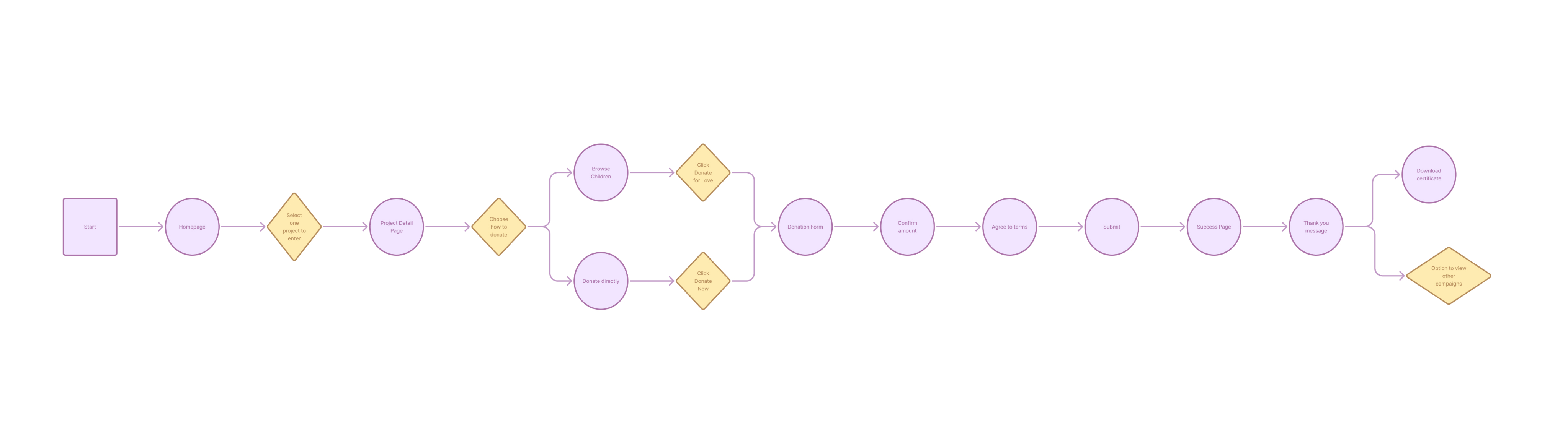
1. Homepage
- Emotional project visuals with real-time status
- Seasonal donation projects drive long-term attentionWhy: Combining emotional imagery with live progress updates builds trust and urgency, while seasonal campaigns create recurring engagement opportunities.
2. Project Detail
- Split flow: donate directly or sponsor a child
- Clear explanation of what each donation coversWhy: Offering two clear paths addresses different donor motivations — immediacy vs. personal connection — while transparency in allocation reduces hesitation.
3. Student Profile
- True stories, daily-life images & quotes build empathy
- “Donate for Love” CTA fixed at bottomWhy: Humanizing the donation request through authentic stories increases emotional resonance, and a persistent CTA ensures actionability without extra navigation.
4. Donation Page
- Smart default: ¥3750 full tuition pre-selected
- Emotional microcopy + flexible amount optionsWhy: Pre-selecting a meaningful default amount reduces decision friction, while emotional copy and flexibility allow donors to give within their means.
5. User Dashboard
- Track donation history + download certificates
- Designed to reinforce a sense of contributionWhy: Showing tangible impact and providing shareable certificates strengthens donor pride and encourages repeat giving.
6. Donation Record (Phase 2)
- Semi-anonymous leaderboard increased engagement by 26.4%
- Motivates participation while balancing privacyWhy: Leveraging social proof boosts motivation, and anonymity options ensure inclusivity for privacy-conscious donors.
Outcome
Over multiple phases (2022–2023), the platform facilitated successful sponsorships and additional initiatives such as book donations. Corporate donors expressed appreciation for the narrative-driven experience, especially the emotional resonance and visual clarity of the platform.
- Donation completion rate: Increased from 68% to 89% after introducing staged payments and clearer progress indicators.
- Engagement time: Average time on donation stories page rose from 1m 45s to 3m 10s, driven by authentic photo storytelling and transparent fund allocation visuals.
Personal Reflection
This project holds a special place in my heart.
Beyond the product design, I was fortunate to contribute to the children’s everyday moments—creating graduation booklets, handwritten tags for their plants, and medals for school events.
Each interview, each page, each detail felt meaningful.
“Design isn’t always about innovation. Sometimes, it’s about listening deeply—and building quiet bridges between people who may never meet, but are still connected.”
This project taught me the value of empathy-led systems—where emotional design, operational clarity, and real-world care work hand in hand.
Designing for donations taught me that trust is the first conversion barrier. Transparency in donation allocation and emotional resonance through authentic stories proved more persuasive than direct monetary appeals.


Case Study
Yangzheng Kindergarten Support Program ——
Love Tuition
Designed a donation platform to support kindergarten tuition for children in Gansu, China — covering donation flows, story-driven content, and trust-building mechanisms — increasing engagement and donation completion rates in internal trials.
UIUX Design
Empathy-led Design
On-site Research
Storytelling
Picture taken in Gansu Province, China. copyright: Oufei Zhao
OverView & Role
This project began as an internal platform for employees at my company to sponsor children in a rural kindergarten in Gansu, China. Each child’s story was carefully documented through interviews and photographs, allowing employees to read, connect, and choose who to support.
Rather than traditional charity websites, this platform emphasizes emotional connection, transparency, and trust. Each donation covers tuition, uniforms, meals, and insurance for a full semester.
While this was initially launched as a company-wide experiment, our long-term goal is to open the platform to the public, creating a scalable system for meaningful, story-led giving.
My Role: UX & UI Designer, Visual Storyteller, Researcher
Beyond the platform, I also designed graduation booklets, medals, and even handmade plant tags for the children. This project became more than just work—it was a personal journey of care, connection, and gratitude.
Movie taken in Gansu Province, China. copyright: Huayang Song
Design Objective
Encourage individual employees to complete donations through a simple, trustworthy, and emotionally resonant experience.
We didn’t just want to make a donation system. We wanted to design a way for our colleagues to meet these children — as humans, not numbers. And we hoped that by making it easy to care, we could make it easier to act.
Pictures taken in Gansu Province, China. copyright: Oufei Zhao
Research & Insight
To ensure the platform responded to real user needs, we conducted dual-focus research:
① Interviews with the Children & Their Families
We visited rural homes and the kindergarten in Gansu, interviewing the children and their caregivers. Their stories formed the emotional core of the platform — each profile is based on a real life, not a persona.
Many children live with grandparents, often in modest homes far from medical or educational resources. Every photo and quote was carefully curated with consent and dignity.
② Feedback from Our Company’s Employees (Internal Donors)
Since this was an internal pilot, we collected feedback through casual conversations, a quick survey, and donation session observations.
Key takeaways:
- Emotional clarity matters. Employees wanted to feel confident that their donation really made a difference. Real stories helped unlock empathy.
- They needed simplicity. Most users only had a few minutes to engage. A clear 2–3 step donation flow was essential.
- Photo s over numbers. Team members responded much more strongly to children’s photos and quotes than to funding stats.
"I chose the child because of her photo. She reminded me of my niece." — a colleague after completing his donation
People donate not just because they believe in a cause
— but because they recognize a face, a story, a connection.
Pictures taken in Gansu Province, China. copyright: Oufei Zhao
Information Architecture
& User Flow
To address the information overload, I worked closely with the ESG team to prioritize and segment the data, ensuring that different user groups could find what they needed without friction.
To manage interface complexity, I created a feature-to-user mapping matrix to understand which functions were relevant to each user group. This helped prioritize content hierarchies and screen layout, ensuring the most frequently accessed modules were surfaced clearly.
Given the interface is displayed on a large touchscreen, special attention was paid to interaction distance, tap targets, and layout rhythm to ensure an accessible and fluid touch experience.
User Journey Overview
Design Process
ーInformation Architecture
To stay true to our sustainability narrative, the concept of “zero carbon” informed not just content but layout and emphasis. We designed the data experience to reflect the building’s dynamic energy flow — balancing energy production and consumption as a living system.
This became the entry point of the interface:A real-time comparison of energy production vs energy consumption on the homepage.
As a storyteller, this offers a clear and compelling hook — a way to immediately ground users in the core idea before inviting them to explore deeper layers of sustainability data.
I conducted informal interviews and feedback sessions with instructors, library staff, and general visitors. These sessions helped clarify pain points and led to clearer, more intuitive content grouping, as well as the addition of narrative layers for public education.
The final interface is structured across three levels of depth:
- Level 1 (Homepage Loop): Key highlights shown in a looping carousel — energy summary, environment conditions, and a library feature (e.g., book recommendations).
- Level 2 (Category View): Topic-based dashboards for deeper exploration — electricity, water, carbon, etc.
- Level 3 (Historical Detail): Time-series data, zone comparisons, and granular usage patterns for expert use.
For presenters and docents, we created special narrative modules including animated power flow diagrams (live Electricity). These help explain the dynamic supply-demand relationship in the zero-carbon system, offering a storytelling layer on top of the data.
Key Screens & Design Decisions
This project was developed in close collaboration with a non-profit foundation team and our in-house frontend engineers. From the start, the goal wasn’t just to “build a donation platform” — it was to create a space where donors could feel an emotional connection with real children in need.
During Phase I, we focused on the core donation flow:
- Working closely with the foundation team, we conducted interviews and home visits to gather real stories from children in Gansu, China.
- Every image, quote, and donation figure was carefully selected to reflect dignity and clarity — The donation amounts (¥200–¥3750) were deliberately chosen to guide decisions: ¥3750, the full tuition package, was pre-selected to gently nudge full sponsorships, while smaller options offered flexibility.
- Micro-copy (button text, confirmation notes) was rewritten multiple times to carry emotional tone without overwhelming the user.
During Phase II, we introduced new features and refinements:
- A semi-anonymous donation record page was added to increase visibility and encourage internal participation. This led to a measurable +33% increase in engagement.
- We redesigned the “My Page” dashboard to offer donors certificates, messages from children, and a space to revisit their contributions.
Throughout both phases, I worked hand-in-hand with frontend developers to ensure layout responsiveness, image compression (due to rural upload constraints), and optimized rendering across browsers. Many UI decisions came from real-time testing with internal employees — including the placement of donation buttons, hover tooltips, and even the softness of typeface.
Key Screens & Design Highlights
1. Homepage
- Emotional project visuals with real-time status
- Seasonal donation projects drive long-term attentionWhy: Combining emotional imagery with live progress updates builds trust and urgency, while seasonal campaigns create recurring engagement opportunities.
2. Project Detail
- Split flow: donate directly or sponsor a child
- Clear explanation of what each donation coversWhy: Offering two clear paths addresses different donor motivations — immediacy vs. personal connection — while transparency in allocation reduces hesitation.
3. Student Profile
- True stories, daily-life images & quotes build empathy
- “Donate for Love” CTA fixed at bottomWhy: Humanizing the donation request through authentic stories increases emotional resonance, and a persistent CTA ensures actionability without extra navigation.
4. Donation Page
- Smart default: ¥3750 full tuition pre-selected
- Emotional microcopy + flexible amount optionsWhy: Pre-selecting a meaningful default amount reduces decision friction, while emotional copy and flexibility allow donors to give within their means.
5. User Dashboard
- Track donation history + download certificates
- Designed to reinforce a sense of contributionWhy: Showing tangible impact and providing shareable certificates strengthens donor pride and encourages repeat giving.
6. Donation Record (Phase 2)
- Semi-anonymous leaderboard increased engagement by 26.4%
- Motivates participation while balancing privacyWhy: Leveraging social proof boosts motivation, and anonymity options ensure inclusivity for privacy-conscious donors.
Outcome
Over multiple phases (2022–2023), the platform facilitated successful sponsorships and additional initiatives such as book donations. Corporate donors expressed appreciation for the narrative-driven experience, especially the emotional resonance and visual clarity of the platform.
- Donation completion rate: Increased from 68% to 89% after introducing staged payments and clearer progress indicators.
- Engagement time: Average time on donation stories page rose from 1m 45s to 3m 10s, driven by authentic photo storytelling and transparent fund allocation visuals.
Personal Reflection
This project holds a special place in my heart.
Beyond the product design, I was fortunate to contribute to the children’s everyday moments—creating graduation booklets, handwritten tags for their plants, and medals for school events.
Each interview, each page, each detail felt meaningful.
“Design isn’t always about innovation. Sometimes, it’s about listening deeply—and building quiet bridges between people who may never meet, but are still connected.”
This project taught me the value of empathy-led systems—where emotional design, operational clarity, and real-world care work hand in hand.
Designing for donations taught me that trust is the first conversion barrier. Transparency in donation allocation and emotional resonance through authentic stories proved more persuasive than direct monetary appeals.

Other Projects


Case Study
Yangzheng Kindergarten Support Program ——
Love Tuition
Designed a donation platform to support kindergarten tuition for children in Gansu, China — covering donation flows, story-driven content, and trust-building mechanisms — increasing engagement and donation completion rates in internal trials.
UIUX Design
Empathy-led Design
On-site Research
Storytelling
Picture taken in Gansu Province, China. copyright: Oufei Zhao
OverView & Role
This project began as an internal platform for employees at my company to sponsor children in a rural kindergarten in Gansu, China. Each child’s story was carefully documented through interviews and photographs, allowing employees to read, connect, and choose who to support.
Rather than traditional charity websites, this platform emphasizes emotional connection, transparency, and trust. Each donation covers tuition, uniforms, meals, and insurance for a full semester.
While this was initially launched as a company-wide experiment, our long-term goal is to open the platform to the public, creating a scalable system for meaningful, story-led giving.
My Role: UX & UI Designer, Visual Storyteller, Researcher
Beyond the platform, I also designed graduation booklets, medals, and even handmade plant tags for the children. This project became more than just work—it was a personal journey of care, connection, and gratitude.
Movie taken in Gansu Province, China. copyright: Huayang Song
Design Objective
Encourage individual employees to complete donations through a simple, trustworthy, and emotionally resonant experience.
We didn’t just want to make a donation system. We wanted to design a way for our colleagues to meet these children — as humans, not numbers. And we hoped that by making it easy to care, we could make it easier to act.
Pictures taken in Gansu Province, China. copyright: Oufei Zhao
Research & Insight
To ensure the platform responded to real user needs, we conducted dual-focus research:
① Interviews with the Children & Their Families
We visited rural homes and the kindergarten in Gansu, interviewing the children and their caregivers. Their stories formed the emotional core of the platform — each profile is based on a real life, not a persona.
Many children live with grandparents, often in modest homes far from medical or educational resources. Every photo and quote was carefully curated with consent and dignity.
② Feedback from Our Company’s Employees (Internal Donors)
Since this was an internal pilot, we collected feedback through casual conversations, a quick survey, and donation session observations.
Key takeaways:
- Emotional clarity matters. Employees wanted to feel confident that their donation really made a difference. Real stories helped unlock empathy.
- They needed simplicity. Most users only had a few minutes to engage. A clear 2–3 step donation flow was essential.
- Photo s over numbers. Team members responded much more strongly to children’s photos and quotes than to funding stats.
"I chose the child because of her photo. She reminded me of my niece." — a colleague after completing his donation
People donate not just because they believe in a cause
— but because they recognize a face, a story, a connection.
Pictures taken in Gansu Province, China. copyright: Oufei Zhao
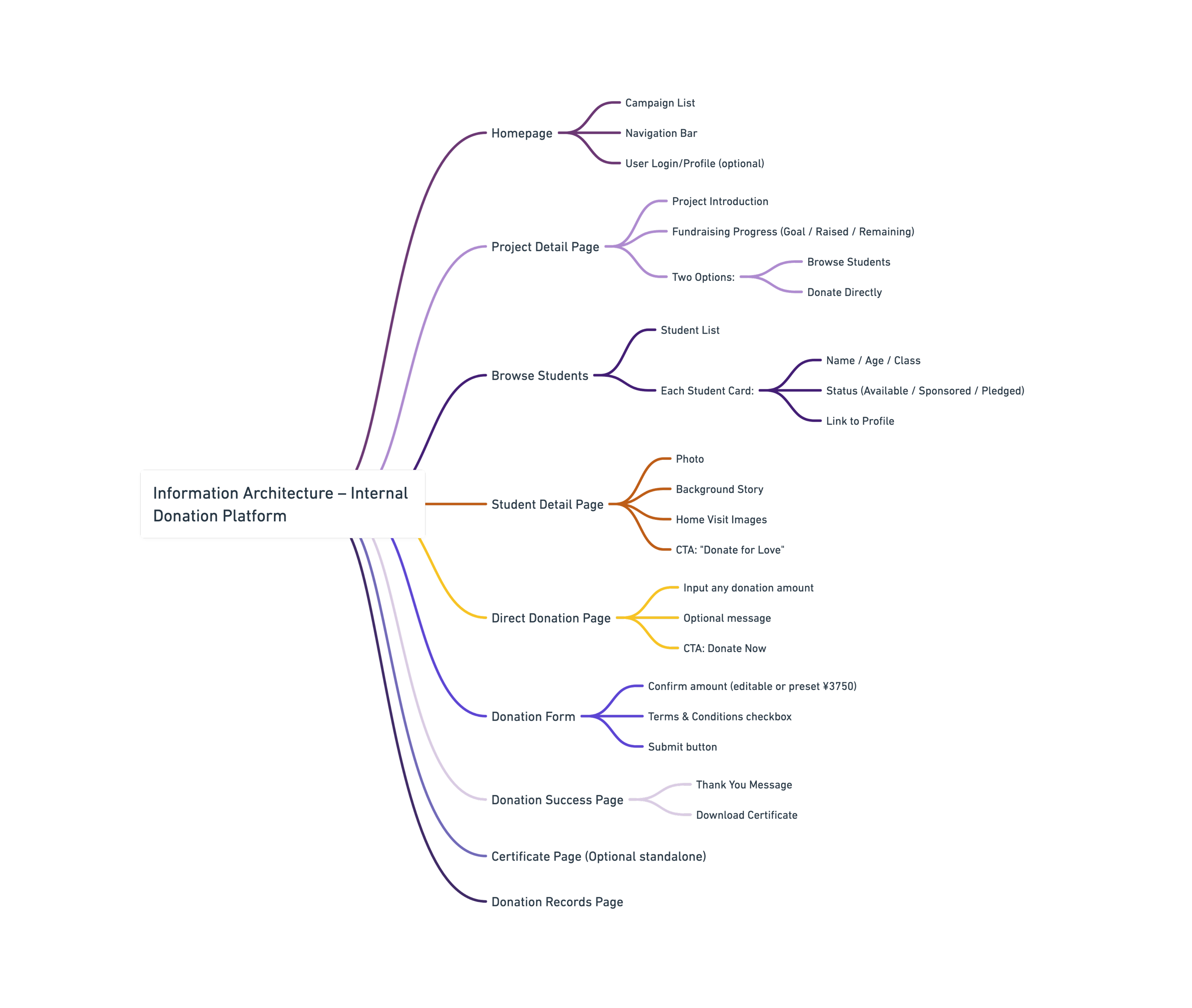
Information Architecture
& User Flow
The donation experience was split into two clear paths:
- One-to-One Sponsorship Users browse student profiles, read their stories, and commit to support them long-term.
- General Donation For companies who wish to support a group initiative (e.g., book donations) without selecting individuals.
To reduce friction and cognitive load, we kept flows to 3 steps max. Each profile featured story summaries, donation status bars, and verified information.
User Journey Overview
Design Process
ーInformation Architecture
To stay true to our sustainability narrative, the concept of “zero carbon” informed not just content but layout and emphasis. We designed the data experience to reflect the building’s dynamic energy flow — balancing energy production and consumption as a living system.
This became the entry point of the interface:A real-time comparison of energy production vs energy consumption on the homepage.
As a storyteller, this offers a clear and compelling hook — a way to immediately ground users in the core idea before inviting them to explore deeper layers of sustainability data.
I conducted informal interviews and feedback sessions with instructors, library staff, and general visitors. These sessions helped clarify pain points and led to clearer, more intuitive content grouping, as well as the addition of narrative layers for public education.
Key Screens & Design Decisions
This project was developed in close collaboration with a non-profit foundation team and our in-house frontend engineers. From the start, the goal wasn’t just to “build a donation platform” — it was to create a space where donors could feel an emotional connection with real children in need.
During Phase I, we focused on the core donation flow:
- Working closely with the foundation team, we conducted interviews and home visits to gather real stories from children in Gansu, China.
- Every image, quote, and donation figure was carefully selected to reflect dignity and clarity — The donation amounts (¥200–¥3750) were deliberately chosen to guide decisions: ¥3750, the full tuition package, was pre-selected to gently nudge full sponsorships, while smaller options offered flexibility.
- Micro-copy (button text, confirmation notes) was rewritten multiple times to carry emotional tone without overwhelming the user.
During Phase II, we introduced new features and refinements:
- A semi-anonymous donation record page was added to increase visibility and encourage internal participation. This led to a measurable +33% increase in engagement.
- We redesigned the “My Page” dashboard to offer donors certificates, messages from children, and a space to revisit their contributions.
Throughout both phases, I worked hand-in-hand with frontend developers to ensure layout responsiveness, image compression (due to rural upload constraints), and optimized rendering across browsers. Many UI decisions came from real-time testing with internal employees — including the placement of donation buttons, hover tooltips, and even the softness of typeface.
Key Screens & Design Highlights
1. Homepage
- Emotional project visuals with real-time status
- Seasonal donation projects drive long-term attentionWhy: Combining emotional imagery with live progress updates builds trust and urgency, while seasonal campaigns create recurring engagement opportunities.
2. Project Detail
- Split flow: donate directly or sponsor a child
- Clear explanation of what each donation coversWhy: Offering two clear paths addresses different donor motivations — immediacy vs. personal connection — while transparency in allocation reduces hesitation.
3. Student Profile
- True stories, daily-life images & quotes build empathy
- “Donate for Love” CTA fixed at bottomWhy: Humanizing the donation request through authentic stories increases emotional resonance, and a persistent CTA ensures actionability without extra navigation.
4. Donation Page
- Smart default: ¥3750 full tuition pre-selected
- Emotional microcopy + flexible amount optionsWhy: Pre-selecting a meaningful default amount reduces decision friction, while emotional copy and flexibility allow donors to give within their means.
5. User Dashboard
- Track donation history + download certificates
- Designed to reinforce a sense of contributionWhy: Showing tangible impact and providing shareable certificates strengthens donor pride and encourages repeat giving.
6. Donation Record (Phase 2)
- Semi-anonymous leaderboard increased engagement by 26.4%
- Motivates participation while balancing privacyWhy: Leveraging social proof boosts motivation, and anonymity options ensure inclusivity for privacy-conscious donors.
Outcome
Over multiple phases (2022–2023), the platform facilitated successful sponsorships and additional initiatives such as book donations. Corporate donors expressed appreciation for the narrative-driven experience, especially the emotional resonance and visual clarity of the platform.
- Donation completion rate: Increased from 68% to 89% after introducing staged payments and clearer progress indicators.
- Engagement time: Average time on donation stories page rose from 1m 45s to 3m 10s, driven by authentic photo storytelling and transparent fund allocation visuals.
Personal Reflection
This project holds a special place in my heart.
Designing for donations taught me that trust is the first conversion barrier. Transparency in donation allocation and emotional resonance through authentic stories proved more persuasive than direct monetary appeals.
Beyond this design, I was fortunate to contribute to the children’s everyday moments—creating graduation booklets, handwritten tags for their plants, and medals for school events.
Each interview, each page, each detail felt meaningful.
Design isn’t always about innovation. Sometimes, it’s about listening deeply—and building quiet bridges between people who may never meet, but are still connected.

Other Projects

0→1 product launches start here.

CONTACT
+44 750 8790 852
hiroshitwi@gmail.com
SOCIAL
If you are interested in art, I also make some sculpture & moving image.
Here is my art page.