Case Study
Reading Carbon:
A Dashboard Like a Book
UIUX Design
Data Classification
Task Overview
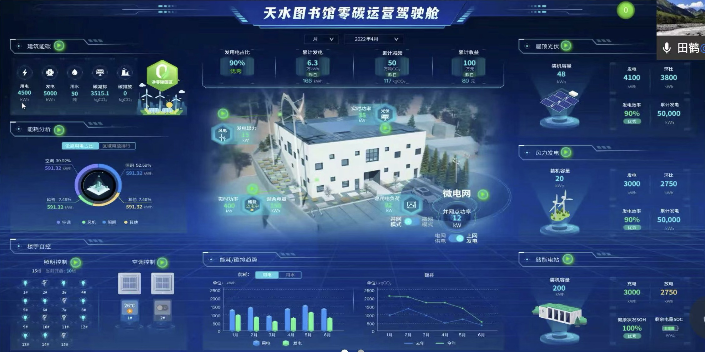
Designing a visual dashboard system for a zero-carbon library. The building is fully self-sufficient, generating and managing its own energy through renewable sources.
As the UI/UX designer, I led the design of the entire interface system—from information architecture to visual language and data visualization.
Core Users
Insights were gathered through stakeholder discussions and desk research, which helped shape the initial personas and user journey assumptions.
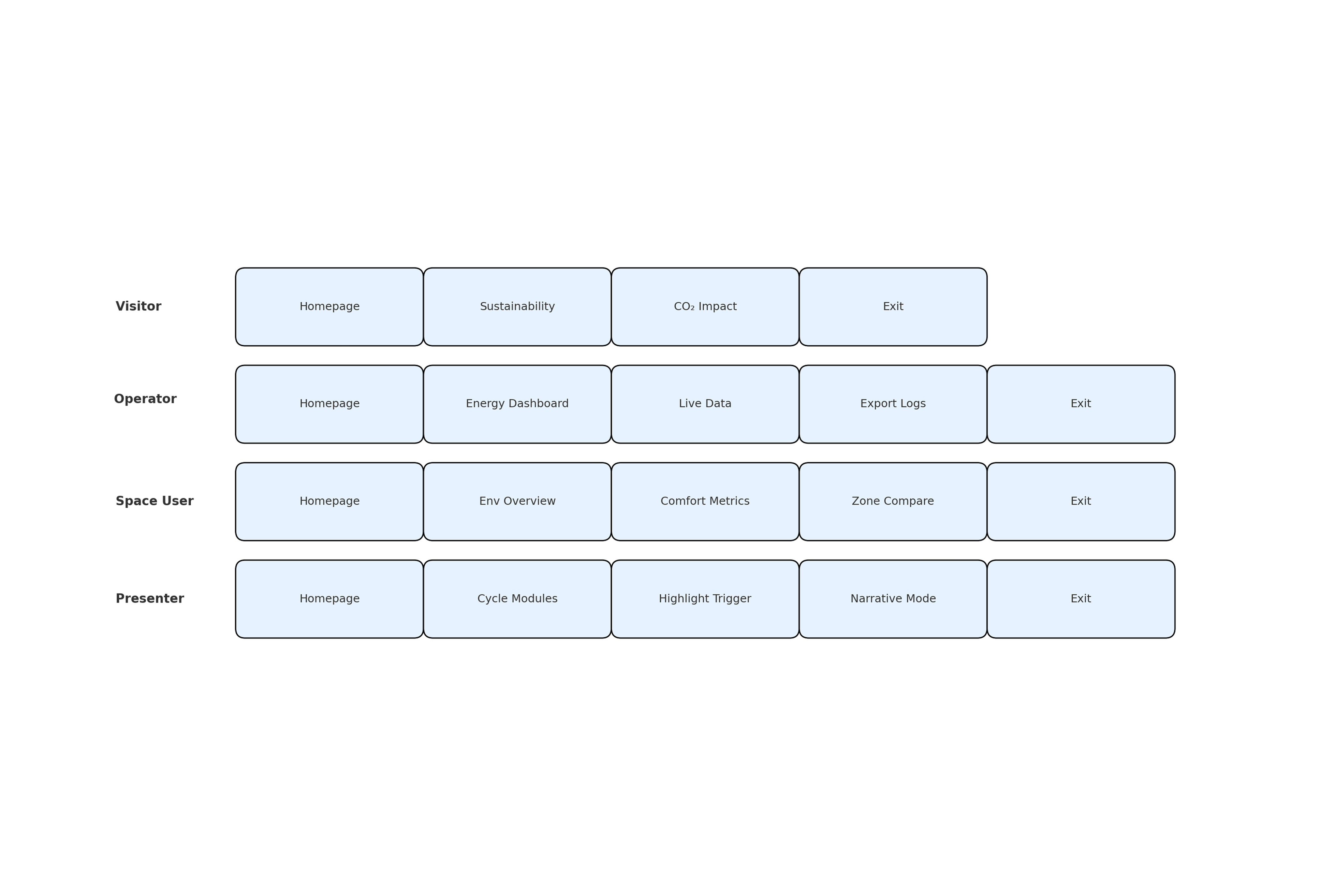
General Visitors (6~70y)
Explore sustainability highlights and learn about the building’s carbon footprint.
Facility Operators(30~40y)
Access live system data, monitor energy use, and export operational logs.
Presenters / Teachers (20~30y)
Use guided storytelling modes to explain the environmental strategies to groups.
Pain point
In addition to desk research and heuristic evaluation, I conducted short interviews with internal stakeholders to test whether they could understand the purpose of existing dashboards and identify the most important data. Their confusion confirmed the need for a more intuitive, visitor-friendly solution.
Design Process
ーCore Concept:
What Does "Zero Carbon" Mean?
Translating an Abstract Concept into a Clear Metric
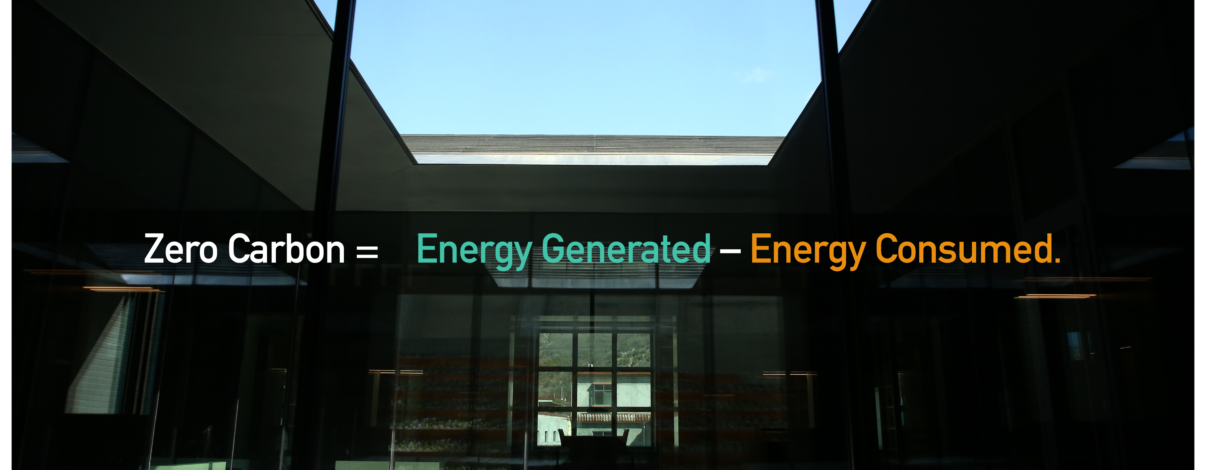
"Zero Carbon" isn't a fixed state—it's a balance. When the energy generated by the building (via solar, wind) equals or exceeds the energy it consumes, it reaches net-zero status.
I visualized this concept through two number on the homepage:
Energy Generated ≥ Energy Consumed
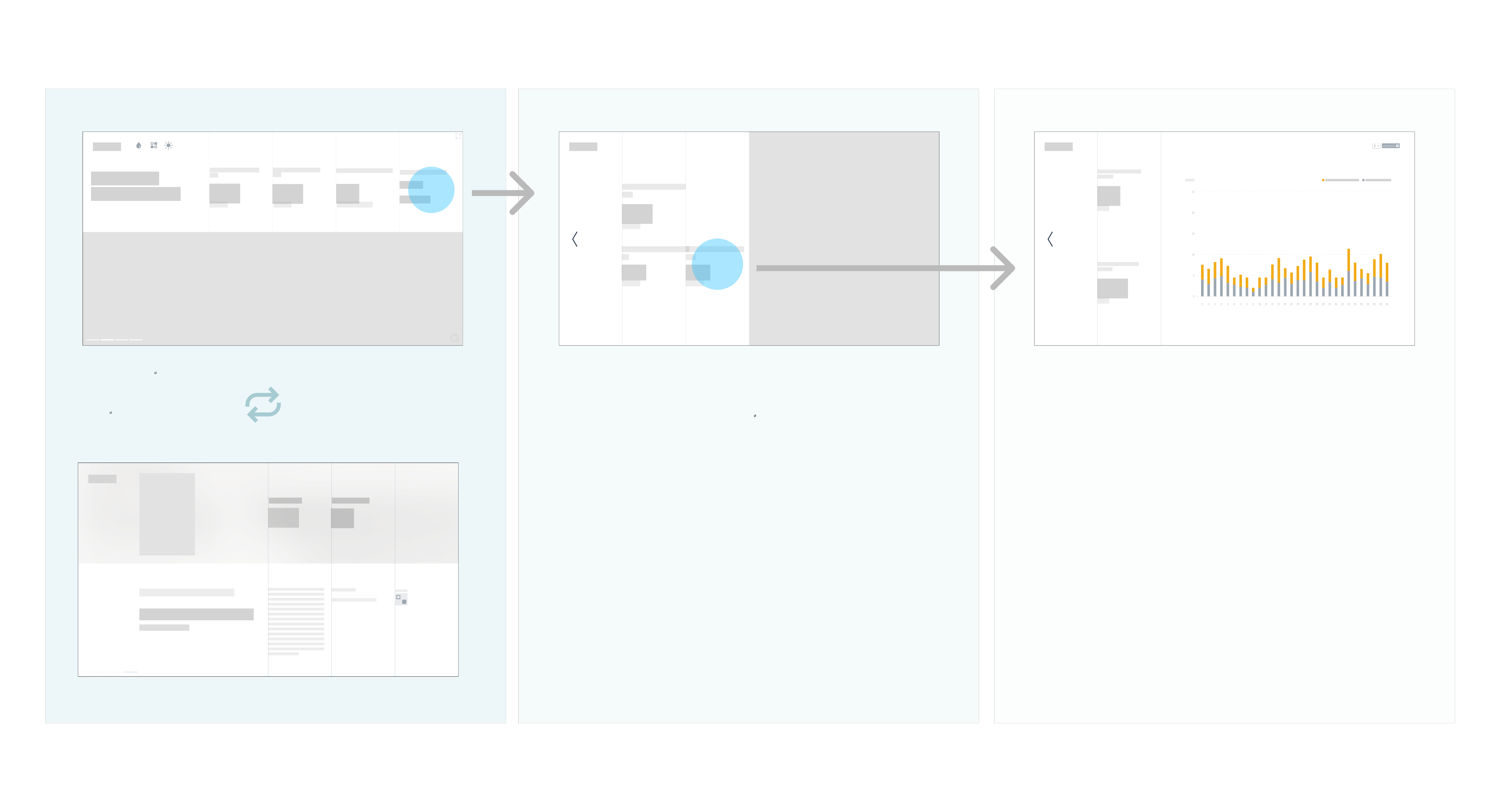
Complex information distilled into essentials, showcased clearly on a rotating homepage view.
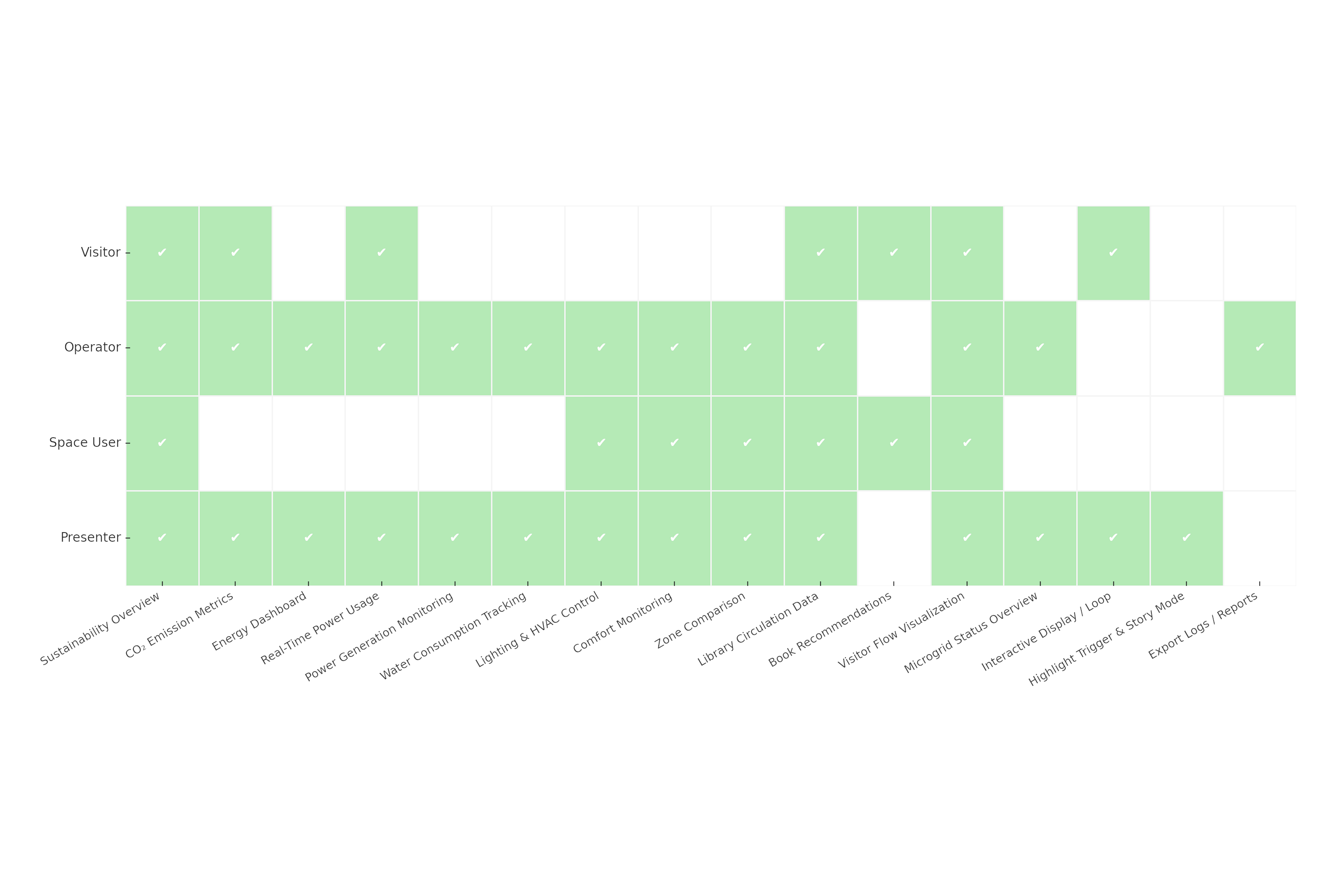
I created a feature–user mapping matrix to simplify the interface and highlight the most-used modules. Working with the ESG team, we segmented data so different user groups could quickly find what they need.
Since the interface runs on a large touchscreen, I optimized tap targets, layout rhythm, and interaction distance for a smooth and accessible touch experience.
Prototype
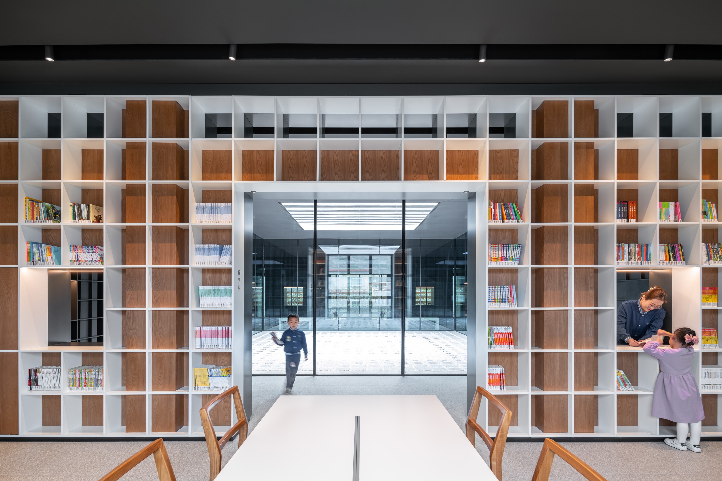
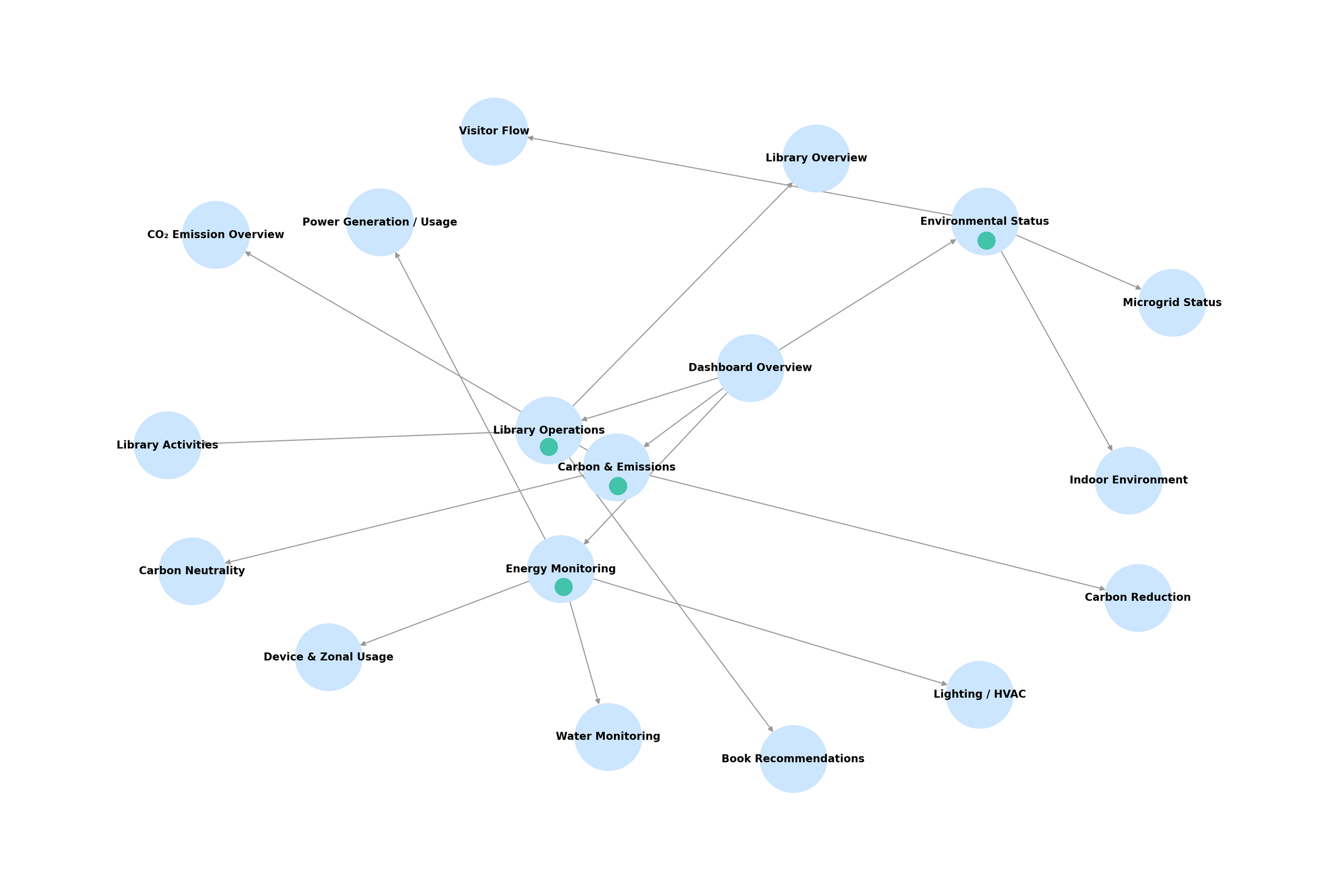
Inspired by library architecture and its sense of classification, I applied a grid system and unified the design into four page models for easy scalability.
Design Approach
We shot a short film to add dynamic visuals, and on the homepage we translated carbon data into intuitive metrics, such as trees planted.
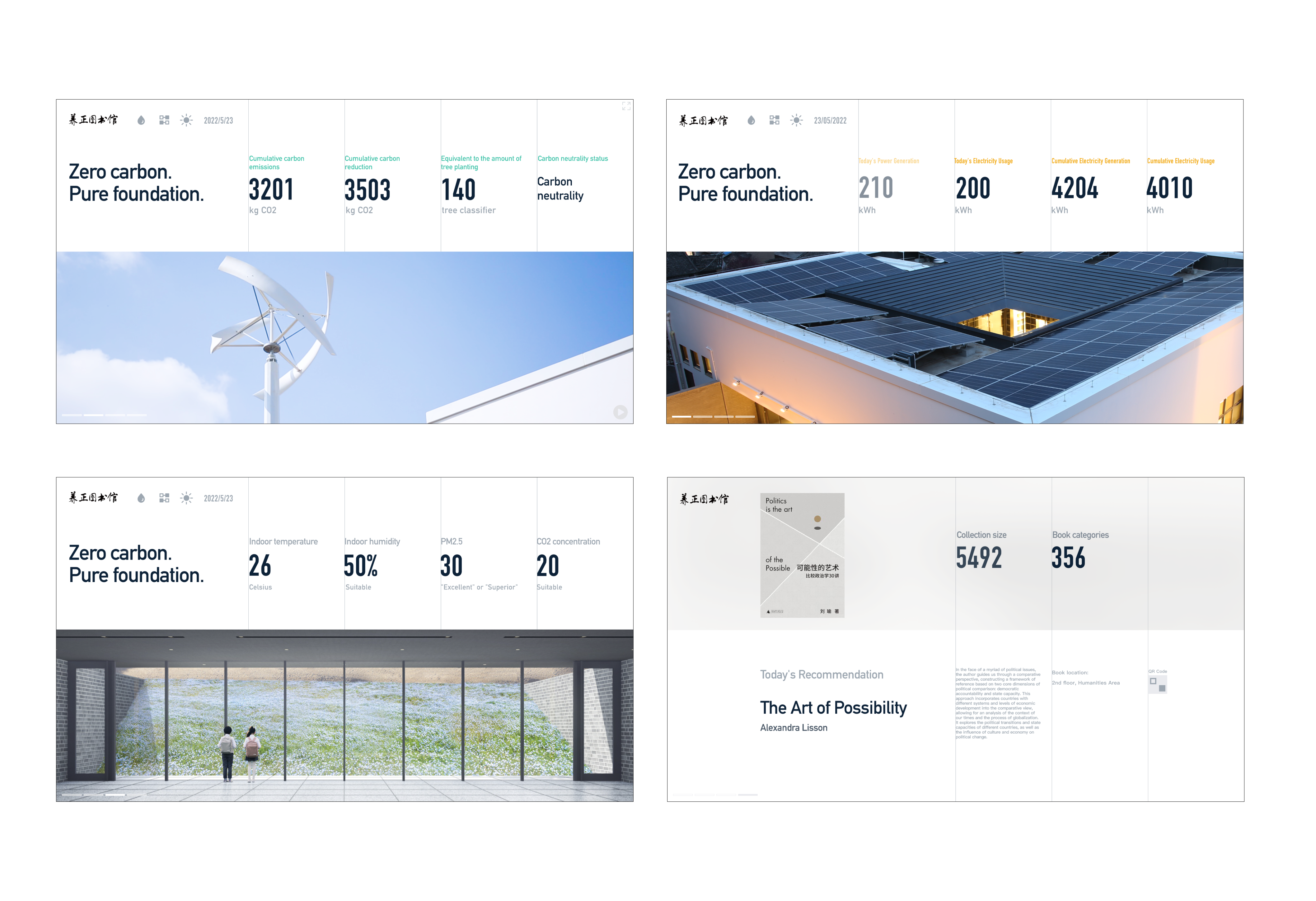
Other pages extend the same style — some provide control functions, others show real-time animations of energy flow, with all data dynamically linked.
Feedback
“The animated energy flow diagram was a fantastic addition — it gave me a clear and engaging way to explain the building's power logic to visitors. People often nodded along when they saw the visual loop of solar to battery to usage.”
—— Lin tao Yu, Lecturer
“It felt more like a story than a dashboard. The interface doesn’t overwhelm — it gradually pulls you in.”
—— Guest
Reflection
Designing with Purpose, for All Audiences
This project allowed me to merge information design, environmental storytelling, and interaction design into a unified interface.
What I learned:
- The power of clear visual metaphors to explain abstract systems
- The importance of cross-functional collaboration in complex data projects
- How to create user flows that serve both experts and laypeople
It’s a project that proves sustainability doesn’t have to be hidden—it can be beautifully, publicly visible.

Other Projects

Corporate Apple B2E E-commerce Platform
→
Yangzheng Kindergarten Love Tuition
→

Corporate ESG Vision Campaign
→

0→1 product launches start here.


CONTACT
+44 750 8790 852
hiroshitwi@gmail.com
SOCIAL

If you are interested in art, I also make some sculpture & moving image. Here’s my art page.

Case Study
Reading Carbon:
A Dashboard Like a Book
UIUX Design
Data Classification
Task Overview
Designing a visual dashboard system for a zero-carbon library. The building is fully self-sufficient, generating and managing its own energy through renewable sources.
As the UI/UX designer, I led the design of the entire interface system—from information architecture to visual language and data visualization.
Core Users
Insights were gathered through stakeholder discussions and desk research, which helped shape the initial personas and user journey assumptions.
General Visitors (6~70y)
Explore sustainability highlights and learn about the building’s carbon footprint.
Facility Operators(30~40y)
Access live system data, monitor energy use, and export operational logs.
Presenters / Teachers (20~30y)
Use guided storytelling modes to explain the environmental strategies to groups.
Pain point
In addition to desk research and heuristic evaluation, I conducted short interviews with internal stakeholders to test whether they could understand the purpose of existing dashboards and identify the most important data. Their confusion confirmed the need for a more intuitive, visitor-friendly solution.
Design Process
ーCore Concept:
What Does "Zero Carbon" Mean?
Translating an Abstract Concept into a Clear Metric
"Zero Carbon" isn't a fixed state—it's a balance. When the energy generated by the building (via solar, wind) equals or exceeds the energy it consumes, it reaches net-zero status.
I visualized this concept through two number on the homepage:
Energy Generated ≥ Energy Consumed
Complex information distilled into essentials, showcased clearly on a rotating homepage view.
I created a feature–user mapping matrix to simplify the interface and highlight the most-used modules. Working with the ESG team, we segmented data so different user groups could quickly find what they need.
Since the interface runs on a large touchscreen, I optimized tap targets, layout rhythm, and interaction distance for a smooth and accessible touch experience.
Prototype
Inspired by library architecture and its sense of classification, I applied a grid system and unified the design into four page models for easy scalability.
Design Approach
We shot a short film to add dynamic visuals, and on the homepage we translated carbon data into intuitive metrics, such as trees planted.
Other pages extend the same style — some provide control functions, others show real-time animations of energy flow, with all data dynamically linked.
Feedback
“The animated energy flow diagram was a fantastic addition — it gave me a clear and engaging way to explain the building's power logic to visitors. People often nodded along when they saw the visual loop of solar to battery to usage.”
—— Lin tao Yu, Lecturer
“It felt more like a story than a dashboard. The interface doesn’t overwhelm — it gradually pulls you in.”
—— Guest
Reflection
Designing with Purpose, for All Audiences
This project allowed me to merge information design, environmental storytelling, and interaction design into a unified interface.
What I learned:
- The power of clear visual metaphors to explain abstract systems
- The importance of cross-functional collaboration in complex data projects
- How to create user flows that serve both experts and laypeople
It’s a project that proves sustainability doesn’t have to be hidden—it can be beautifully, publicly visible.


Case Study
Reading Carbon:
A Dashboard Like a Book
UIUX Design
Data Classification
Task Overview
Designing a visual dashboard system for a zero-carbon library. The building is fully self-sufficient, generating and managing its own energy through renewable sources.
As the UI/UX designer, I led the design of the entire interface system—from information architecture to visual language and data visualization.
Core Users
Insights were gathered through stakeholder discussions and desk research, which helped shape the initial personas and user journey assumptions.
General Visitors (6~70y)
Explore sustainability highlights and learn about the building’s carbon footprint.
Facility Operators(30~40y)
Access live system data, monitor energy use, and export operational logs.
Presenters / Teachers (20~30y)
Use guided storytelling modes to explain the environmental strategies to groups.
Pain point
In addition to desk research and heuristic evaluation, I conducted short interviews with internal stakeholders to test whether they could understand the purpose of existing dashboards and identify the most important data. Their confusion confirmed the need for a more intuitive, visitor-friendly solution.
Design Process
ーCore Concept:
What Does "Zero Carbon" Mean?
Translating an Abstract Concept into a Clear Metric
"Zero Carbon" isn't a fixed state—it's a balance. When the energy generated by the building (via solar, wind) equals or exceeds the energy it consumes, it reaches net-zero status.
I visualized this concept through two number on the homepage:
Energy Generated ≥ Energy Consumed
Solution
Complex information distilled into essentials, showcased clearly on a rotating homepage view.
I created a feature–user mapping matrix to simplify the interface and highlight the most-used modules. Working with the ESG team, we segmented data so different user groups could quickly find what they need.
Since the interface runs on a large touchscreen, I optimized tap targets, layout rhythm, and interaction distance for a smooth and accessible touch experience.
Prototype
Inspired by library architecture and its sense of classification, I applied a grid system and unified the design into four page models for easy scalability.
Design Approach
We shot a short film to add dynamic visuals, and on the homepage we translated carbon data into intuitive metrics, such as trees planted.
Other pages extend the same style — some provide control functions, others show real-time animations of energy flow, with all data dynamically linked.
Feedback
“The animated energy flow diagram was a fantastic addition — it gave me a clear and engaging way to explain the building's power logic to visitors. People often nodded along when they saw the visual loop of solar to battery to usage.”
—— Lin tao Yu, Lecturer
“It felt more like a story than a dashboard. The interface doesn’t overwhelm — it gradually pulls you in.”
—— Guest
Reflection
Designing with Purpose, for All Audiences
This project allowed me to merge information design, environmental storytelling, and interaction design into a unified interface.
What I learned:
- The power of clear visual metaphors to explain abstract systems
- The importance of cross-functional collaboration in complex data projects
- How to create user flows that serve both experts and laypeople
It’s a project that proves sustainability doesn’t have to be hidden—it can be beautifully, publicly visible.


