Case Study
When ESG Becomes an Experience
A visual-led campaign to present our ESG vision through exhibition design, digital visuals, and partner recognition.
Visual Design,
Spatial Presentation
OverView & Role
I was responsible for the development of the overall theme and narrative of the campaign, the creation of the visual identity system, and the design of all promotional assets—ranging from digital screens to print materials and spatial graphics.
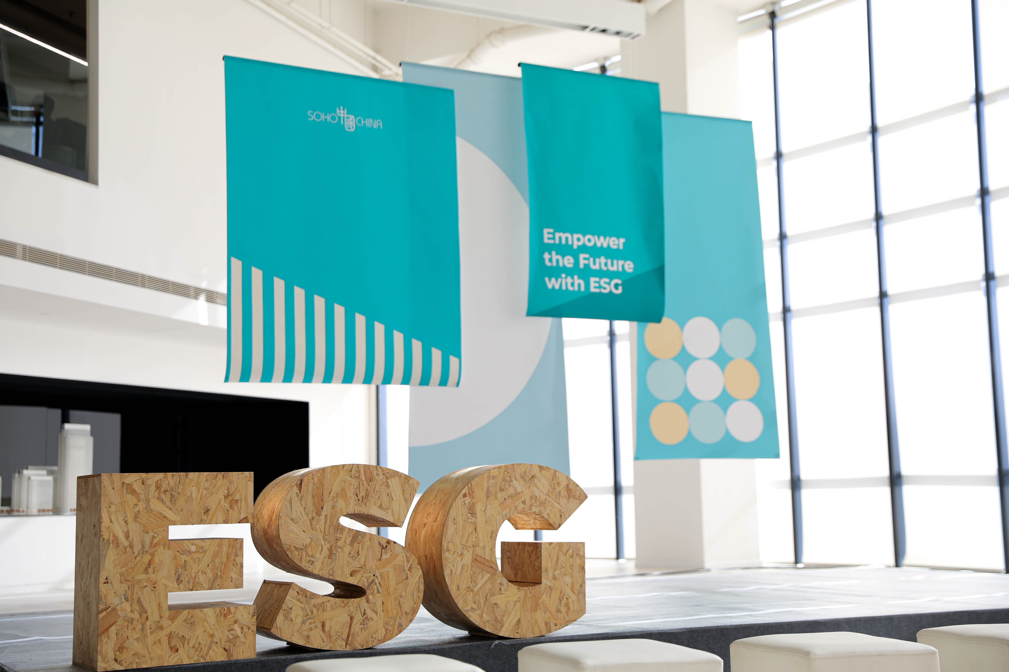
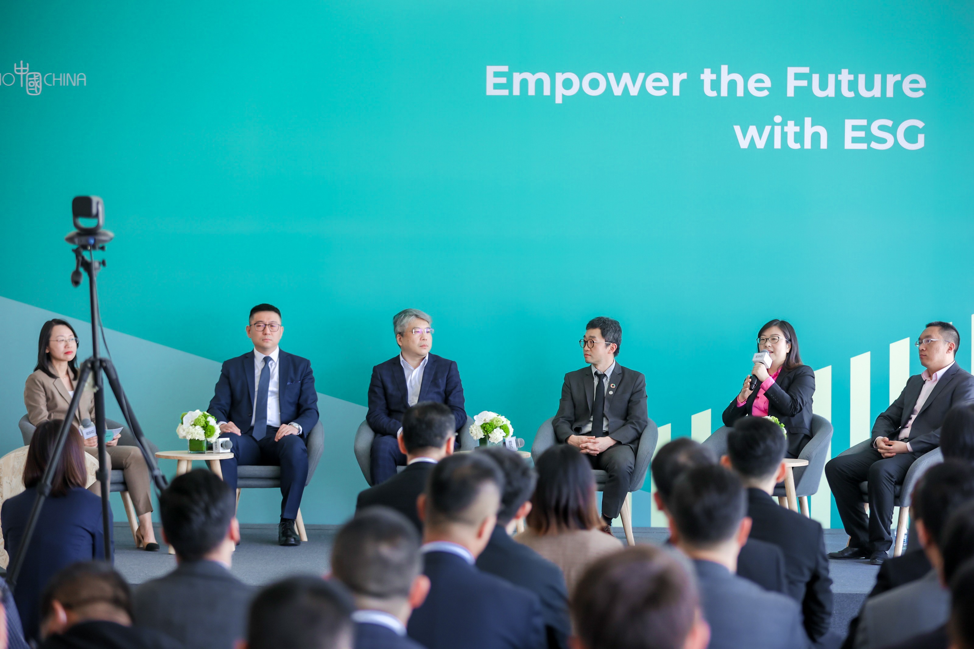
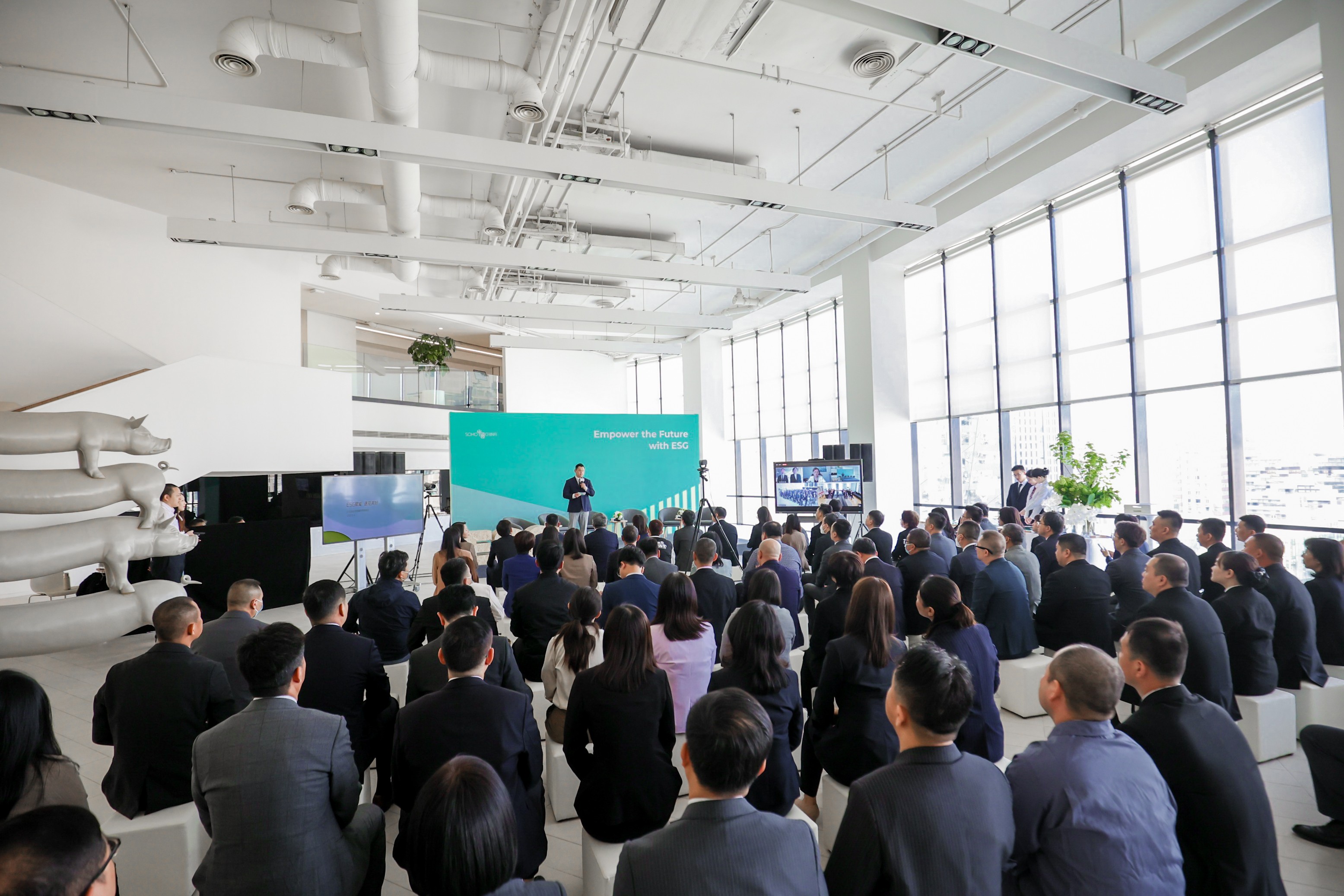
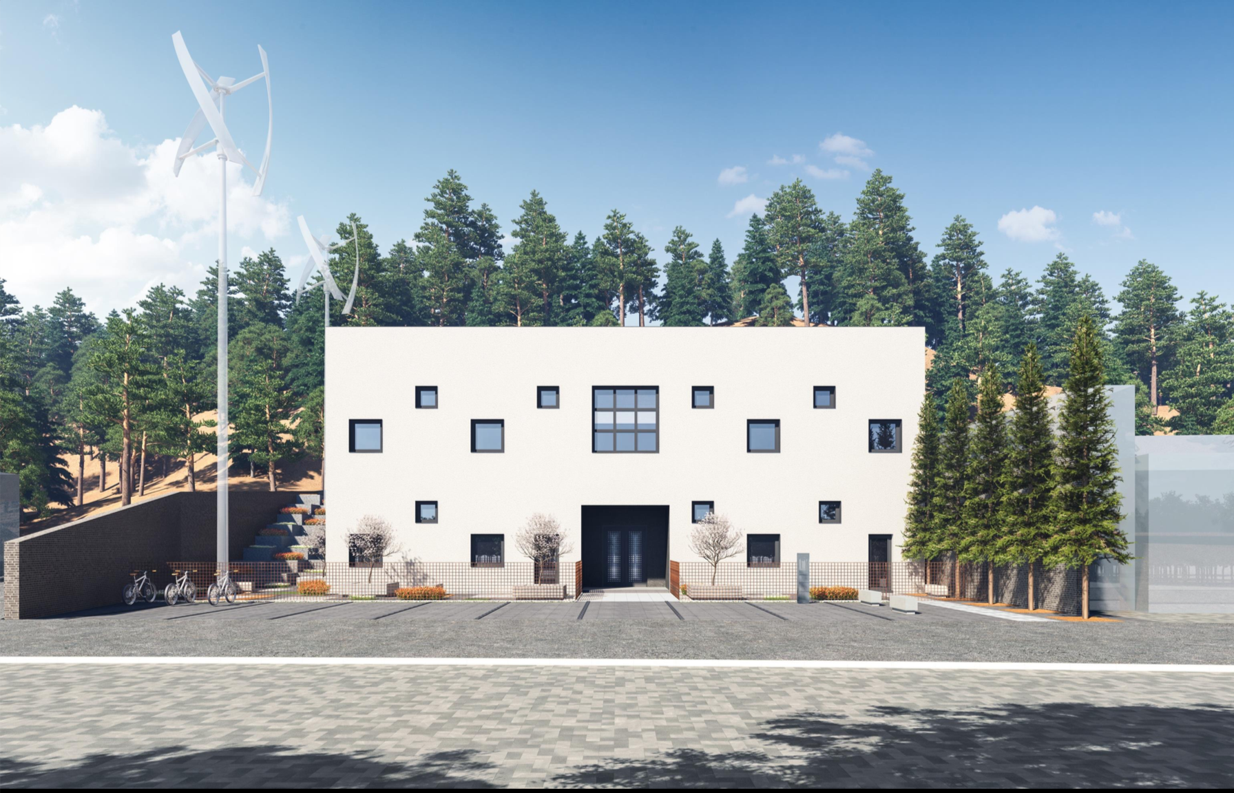
Live Photo. Copyright: Huayang Song

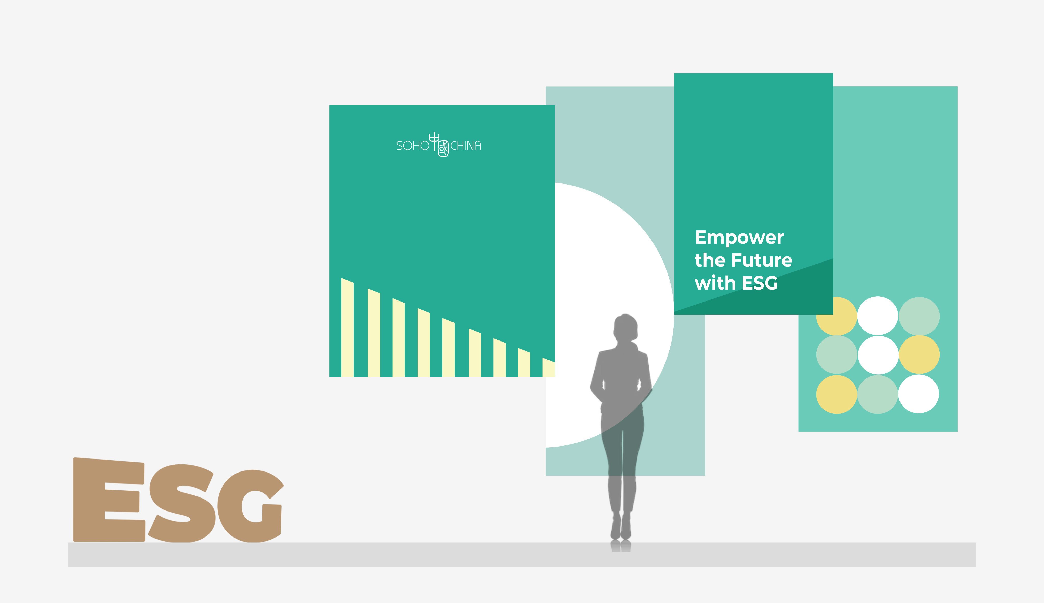
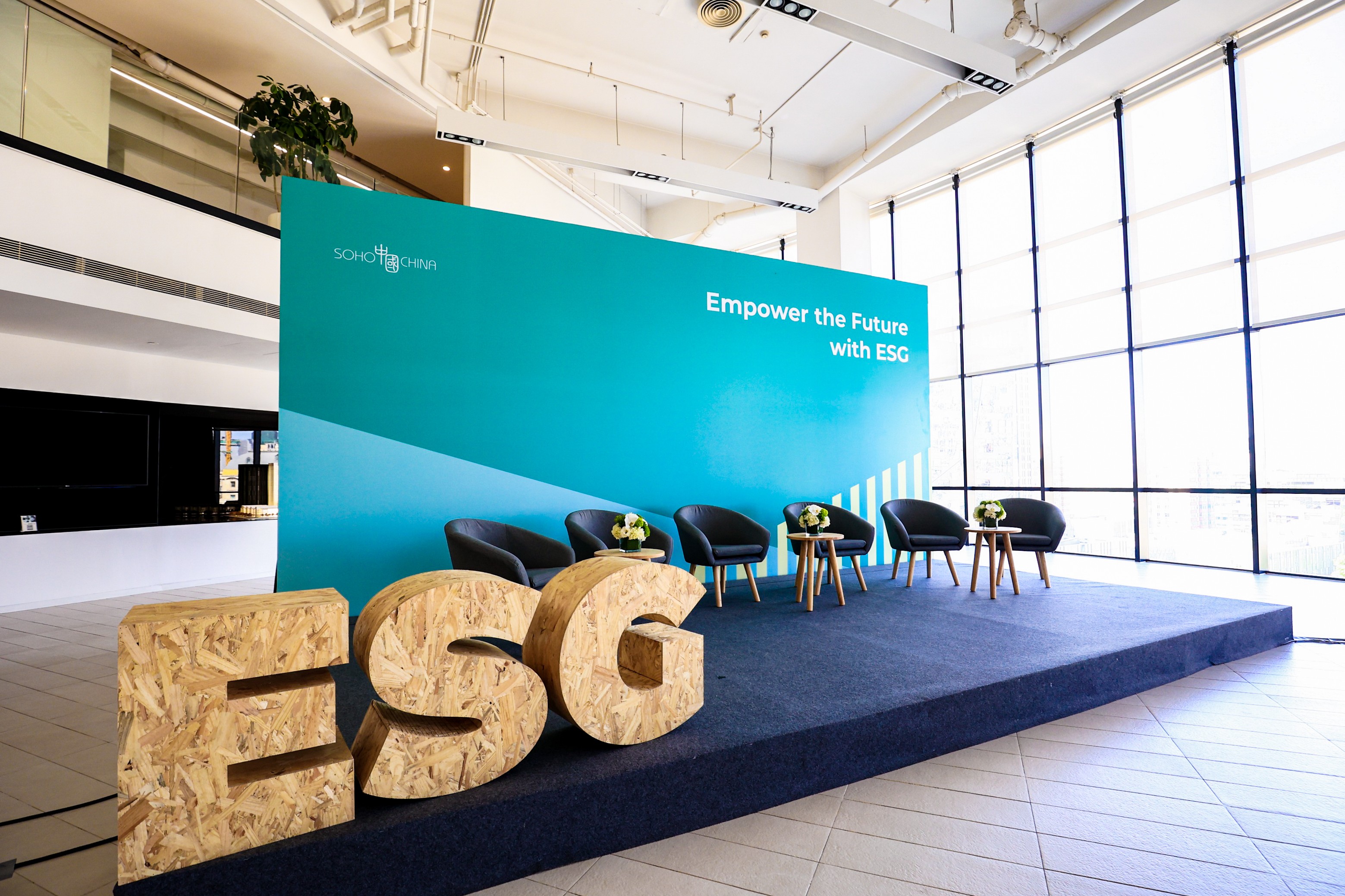
Color System –
Visualizing ESG Pillars
The visual identity uses a three-color system, each representing one of the ESG pillars:
- Green for Environment – Sustainability, climate action, ecological responsibility
- Yellow for Social – Equity, inclusion, human impact
- Blue for Governance – Transparency, ethics, accountability
The color scheme guides users through different sections of the exhibition and digital platform, providing intuitive, non-verbal orientation while reinforcing our core values.
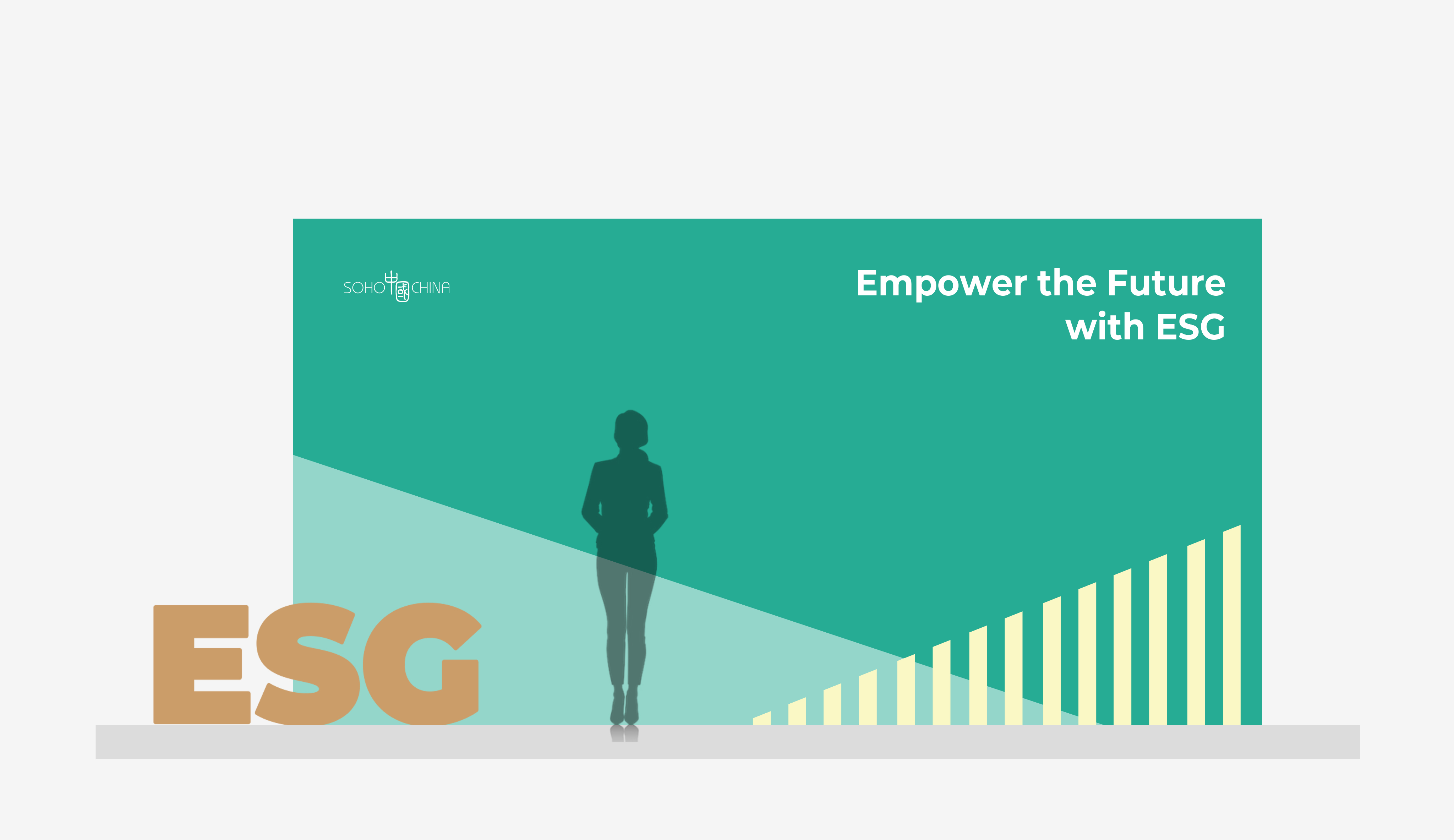
Design Rationale –
Exhibition Backdrop
The exhibition board was one of the most important visual elements of the campaign. I initially proposed a layered canvas structure to create depth and visual interest. However, after presenting the concept to leadership, the feedback highlighted concerns about stability and formality.
While the multi-layered version offered a more contemporary feel—potentially appealing to younger audiences or more lightweight events—it became clear that a more grounded, traditional backdrop would better suit the presence of high-profile guests and group appearances.
This shift reflects how visual design must not only innovate but also adapt to the context, audience, and tone of the occasion.
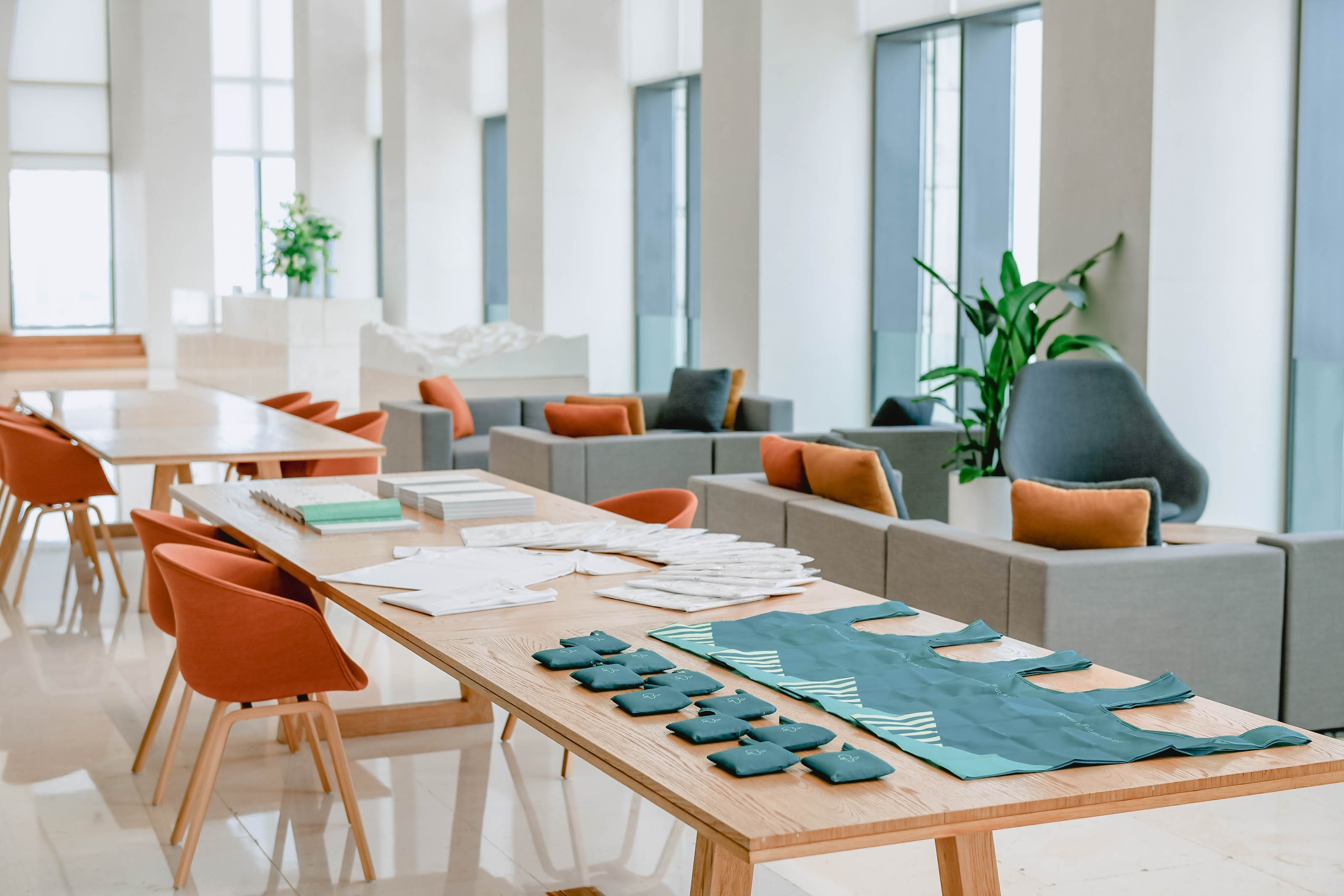
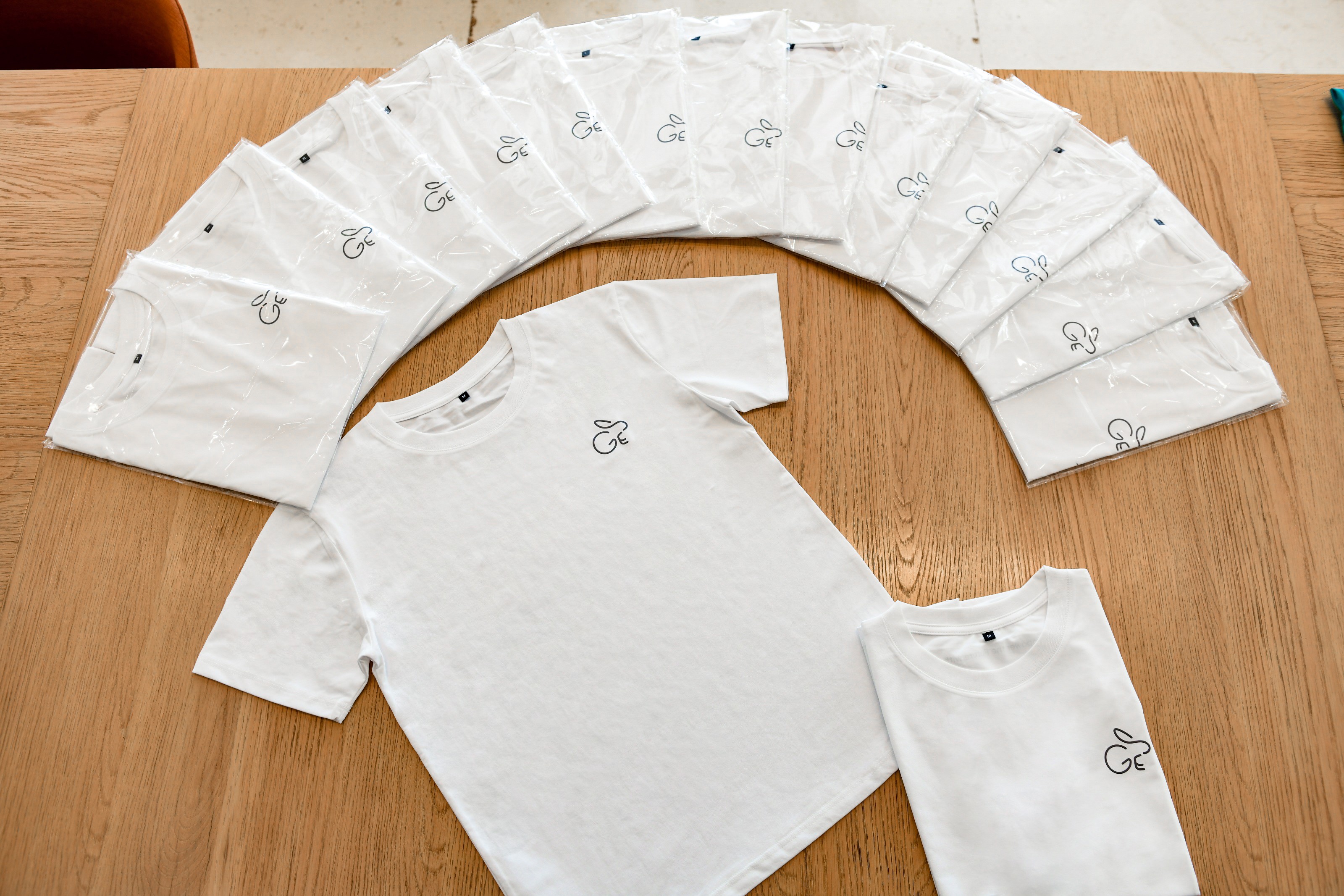
As a playful nod to the Year of the Rabbit, I created a small ESG-themed mascot—a bunny character embodying agility, care, and growth. It was used across select campaign merch and digital badges, adding a light-hearted yet memorable element to the otherwise formal ESG theme.
All merchandise items were produced using recycled materials, including tote bags and T-shirts made from repurposed plastic bottles.
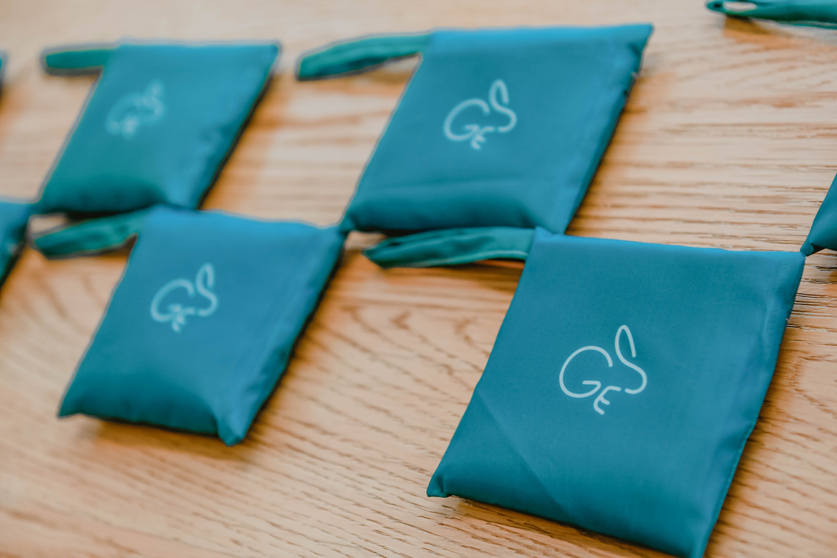
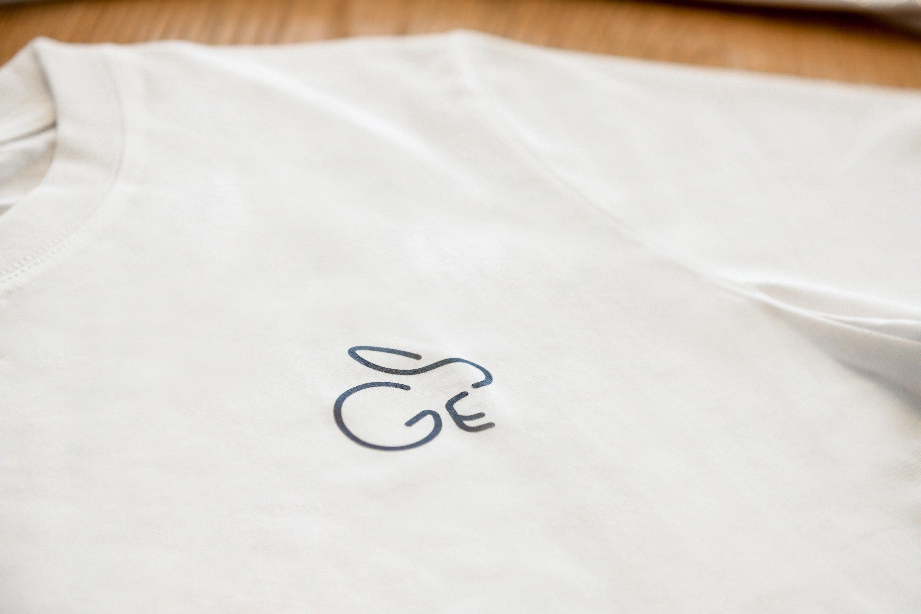
recycled PET plastic bag and shirts
Refelction
This project challenged me to adapt visual ideas to real-world contexts. From reworking the exhibition backdrop to suit a more formal audience, to designing sustainable merchandise and a playful mascot, I learned how to balance creativity, brand tone, and practicality—while staying true to the campaign’s ESG vision.
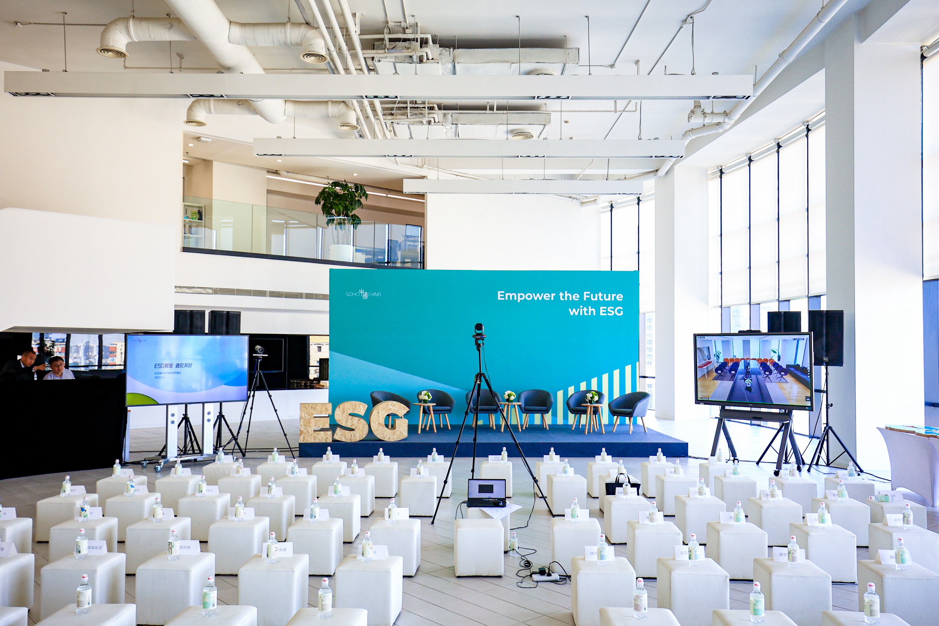
Live Photo. Photographer: Huayang Song

Other Projects

Corporate Apple B2E E-commerce Platform
→
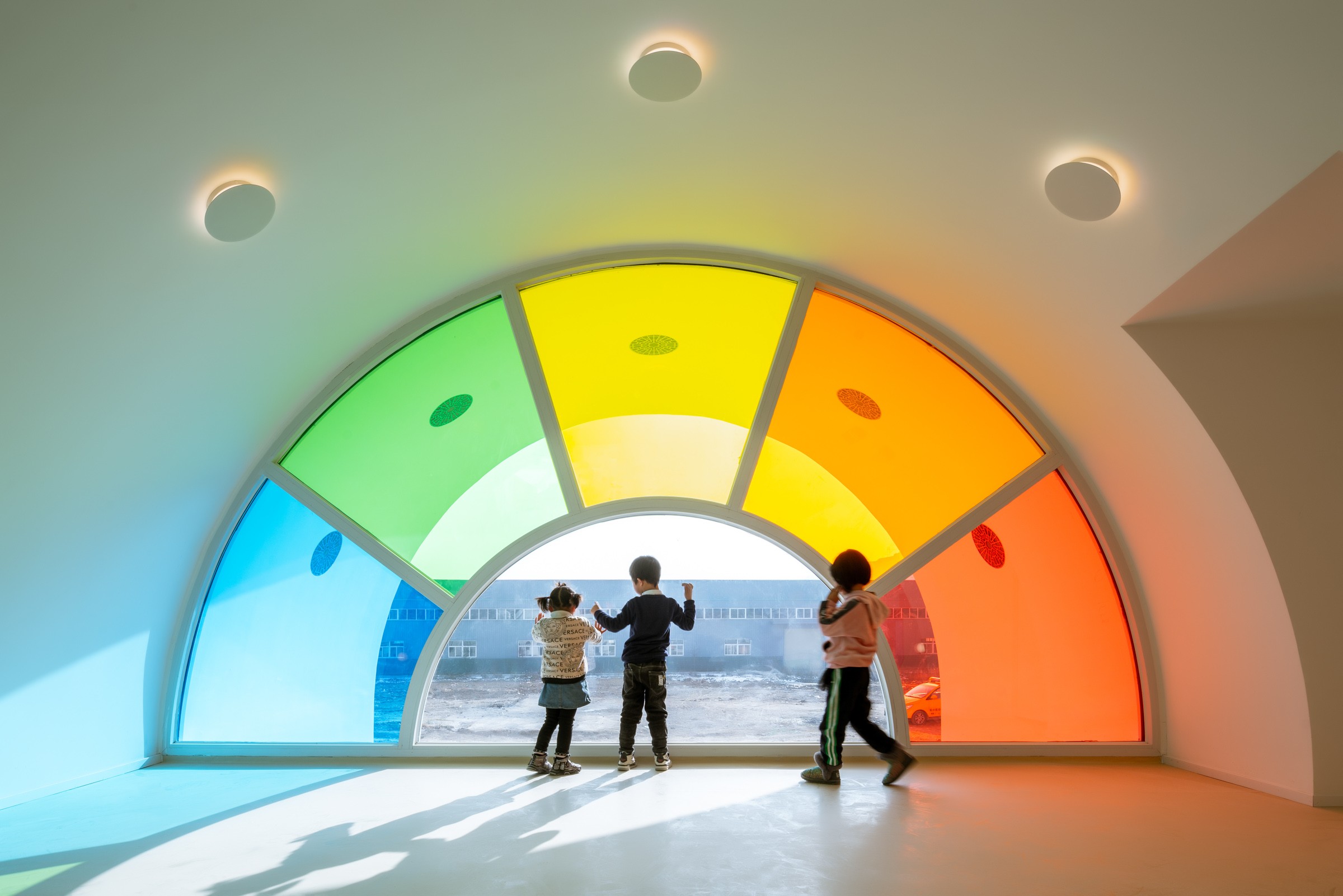
Yangzheng Kindergarten Love Tuition
→
Sculpture: Is it still (Artwork)
→

0→1 product launches start here.


CONTACT
+44 750 8790 852
hiroshitwi@gmail.com
SOCIAL

If you are interested in art, I also make some sculpture & moving image. Here’s my art page.

Case Study
When ESG Becomes an Experience
A visual-led campaign to present our ESG vision through exhibition design, digital visuals, and partner recognition.
Visual Design,
Spatial Presentation
OverView & Role
I was responsible for the development of the overall theme and narrative of the campaign, the creation of the visual identity system, and the design of all promotional assets—ranging from digital screens to print materials and spatial graphics.
Live Photo. Copyright: Huayang Song
Color System –
Visualizing ESG Pillars
The visual identity uses a three-color system, each representing one of the ESG pillars:
- Green for Environment – Sustainability, climate action, ecological responsibility
- Yellow for Social – Equity, inclusion, human impact
- Blue for Governance – Transparency, ethics, accountability
The color scheme guides users through different sections of the exhibition and digital platform, providing intuitive, non-verbal orientation while reinforcing our core values.
Design Rationale –
Exhibition Backdrop
The exhibition board was one of the most important visual elements of the campaign. I initially proposed a layered canvas structure to create depth and visual interest. However, after presenting the concept to leadership, the feedback highlighted concerns about stability and formality.
While the multi-layered version offered a more contemporary feel—potentially appealing to younger audiences or more lightweight events—it became clear that a more grounded, traditional backdrop would better suit the presence of high-profile guests and group appearances.
This shift reflects how visual design must not only innovate but also adapt to the context, audience, and tone of the occasion.
As a playful nod to the Year of the Rabbit, I created a small ESG-themed mascot—a bunny character embodying agility, care, and growth. It was used across select campaign merch and digital badges, adding a light-hearted yet memorable element to the otherwise formal ESG theme.
All merchandise items were produced using recycled materials, including tote bags and T-shirts made from repurposed plastic bottles.
recycled PET plastic bag and shirts
Refelction
This project challenged me to adapt visual ideas to real-world contexts. From reworking the exhibition backdrop to suit a more formal audience, to designing sustainable merchandise and a playful mascot, I learned how to balance creativity, brand tone, and practicality—while staying true to the campaign’s ESG vision.
Live Photo. Photographer: Huayang Song


Case Study
When ESG Becomes an Experience
A visual-led campaign to present our ESG vision through exhibition design, digital visuals, and partner recognition.
Visual Design,
Spatial Presentation
OverView & Role
I was responsible for the development of the overall theme and narrative of the campaign, the creation of the visual identity system, and the design of all promotional assets—ranging from digital screens to print materials and spatial graphics.
Live Photo. Copyright: Huayang Song
Color System –
Visualizing ESG Pillars
The visual identity uses a three-color system, each representing one of the ESG pillars:
- Green for Environment – Sustainability, climate action, ecological responsibility
- Yellow for Social – Equity, inclusion, human impact
- Blue for Governance – Transparency, ethics, accountability
The color scheme guides users through different sections of the exhibition and digital platform, providing intuitive, non-verbal orientation while reinforcing our core values.
Design Rationale –
Exhibition Backdrop
The exhibition board was one of the most important visual elements of the campaign. I initially proposed a layered canvas structure to create depth and visual interest. However, after presenting the concept to leadership, the feedback highlighted concerns about stability and formality.
While the multi-layered version offered a more contemporary feel—potentially appealing to younger audiences or more lightweight events—it became clear that a more grounded, traditional backdrop would better suit the presence of high-profile guests and group appearances.
This shift reflects how visual design must not only innovate but also adapt to the context, audience, and tone of the occasion.
Research & Insights
ーContent Prioritization
As a playful nod to the Year of the Rabbit, I created a small ESG-themed mascot—a bunny character embodying agility, care, and growth. It was used across select campaign merch and digital badges, adding a light-hearted yet memorable element to the otherwise formal ESG theme.
All merchandise items were produced using recycled materials, including tote bags and T-shirts made from repurposed plastic bottles.
recycled PET plastic bag and shirts
Refelction
This project challenged me to adapt visual ideas to real-world contexts. From reworking the exhibition backdrop to suit a more formal audience, to designing sustainable merchandise and a playful mascot, I learned how to balance creativity, brand tone, and practicality—while staying true to the campaign’s ESG vision.
Live Photo. Photographer: Huayang Song


