Case Study
Another Chance for Resellers:
Apple’s B2E Platform
UIUX Design
Mobile B2E E-commerce
Accessibility Design

Business Background:
Why This Platform
Apple collaborated with its enterprise clients to explore a more structured approach to employee-exclusive commerce.
While reseller sales channels already existed, they were fragmented, manual, and hard to control at scale. Employees often had to contact local resellers individually, which led to inconsistent pricing, poor product availability, and growing frustration — especially around new launches.
At the same time, the public Apple Store was facing rising pressure from scalper activity and legacy device clearance challenges.
The goal was to design a centralized platform that:
- Provides employees with exclusive access to Apple products
- Allows better visibility and control over reseller inventory
- Streamlines post-sale services through verified enterprise channels
This initiative marked Apple’s effort to formalize and digitize an already existing reseller network, with clear user experience standards and backend support.
Sourced from Apple’s Employee Choice website. They are used solely for portfolio and educational purposes.

Core Users
- The user roles were defined based on the platform’s operational model and validated through early internal interviews and process mapping with Apple’s enterprise division.
- Although only employees interacted with the app interface, resellers played an equally critical role in the overall experience — managing stock, pushing local promotions, and supporting pickup logistics.
- Thus, we framed our product logic around two user types:
- 🧑💼 Enterprise Employees (Buyers): Seeking early access, discounts, and a frictionless purchase experience
- 🏪 Authorized Resellers (Sellers): Managing SKUs, enabling clearance sales, and facilitating local fulfillment
Persona
- Kevin, 34
- Job: IT Manager at a Fortune 500 companyTech Level: High
Goals:
- Reserve new Apple products before public release
- Find local resellers with available stock
- Occasionally purchase in bulk for team setup
Pain Points:
- Frustrated by out-of-stock issues on Apple’s public store
- No single place to track legacy models
- Prefers not to contact resellers manually
This persona was created based on informal interviews and typical enterprise procurement behaviors.
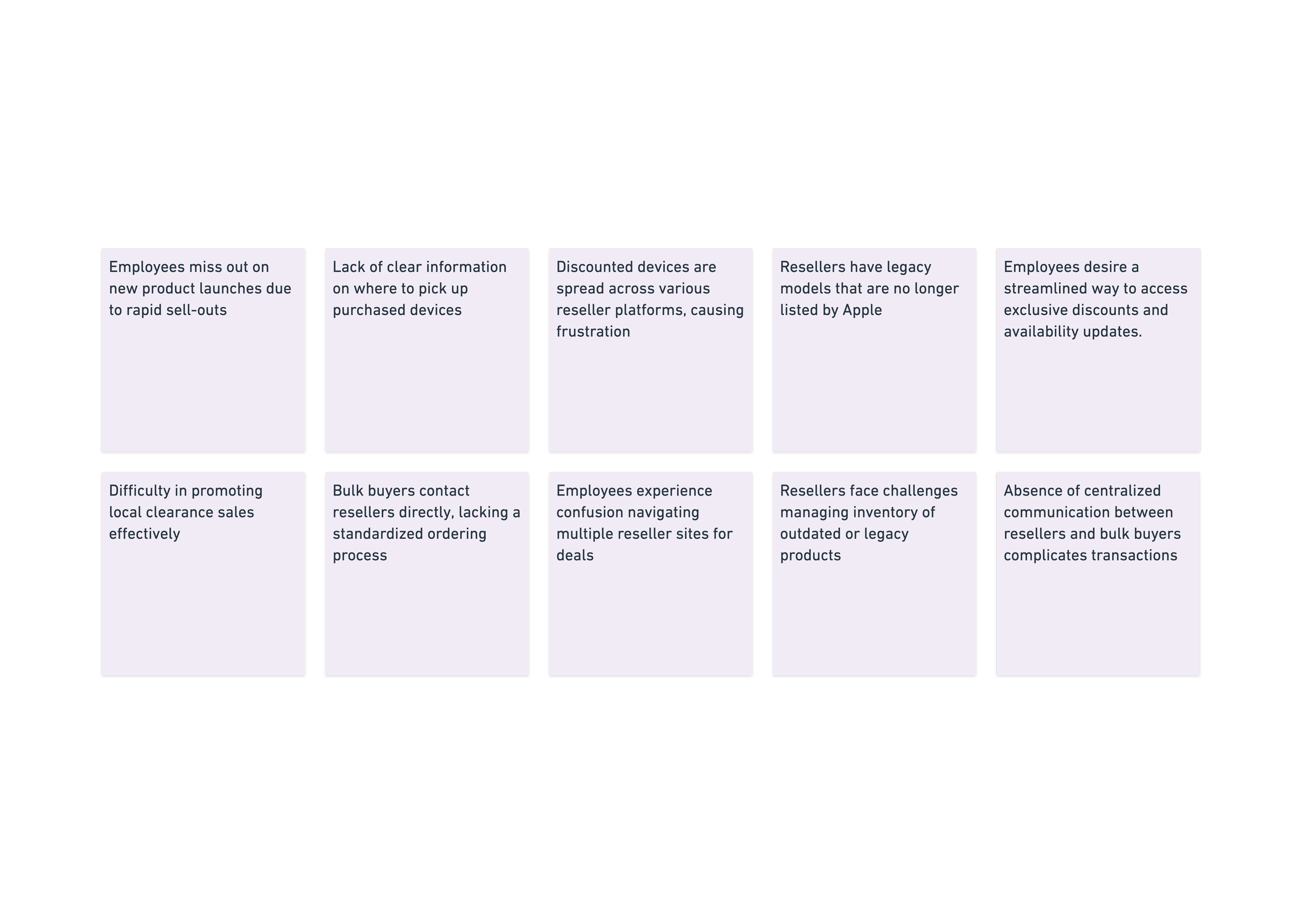
Pain Points from Both Sides:Based on informal interviews and internal discussions, we identified key pain points
Given limited access to end users, we employed a hybrid research approach:
- Heuristic analysis of Apple Store App and major Chinese e-commerce platforms (JD, Tmall)
- Competitive benchmarking of enterprise purchasing flows (e.g. Lenovo B2B, Huawei Enterprise Portal)
- Informal interviews with 3 enterprise employees and 2 resellers
Design Goals & Feature Highlights
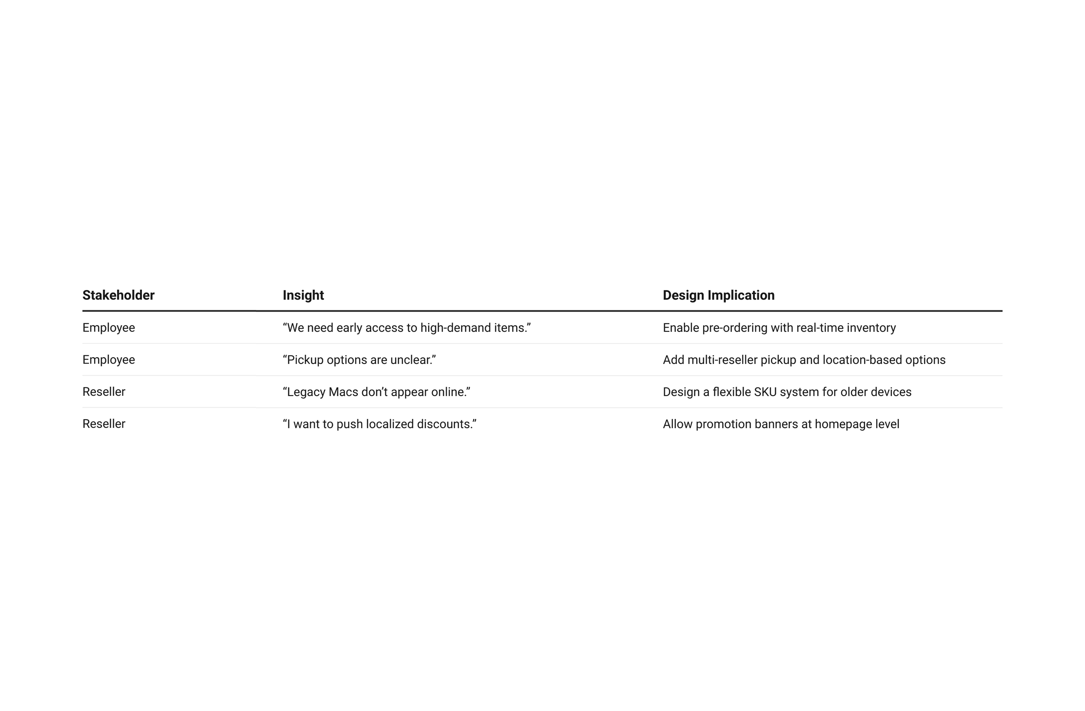
Our key product features were directly derived from user pain points:
🎯 For Employees
- Reserve newly launched or out-of-stock products
- Access exclusive discounted devices
- Choose from multiple local pickup options
- Fill contact forms for custom needs (e.g. bulk buy, delivery scheduling)
🎯 For Resellers
- Self-manage legacy SKUs in the backend
- Customize product availability by region
- Create and publish local promotions
- Connect with high-quality enterprise users directly
*Due to variability across reseller backend systems, this design scope covers only the employee-facing experience. SKU standardization and reseller promotion tools are part of a separate stream and will be addressed in subsequent phases of the project.
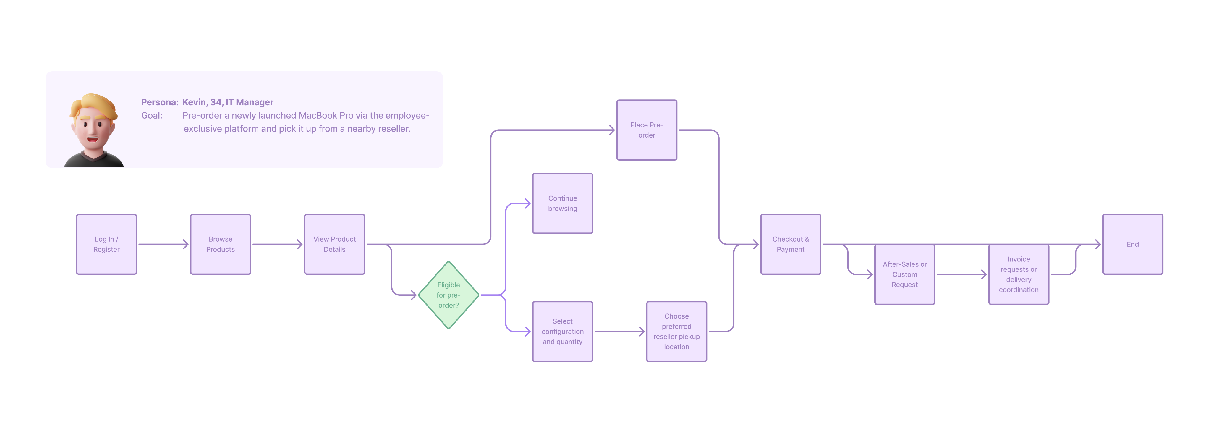
User Journey – Enterprise Employee (Buyer)
The platform was designed to guide enterprise employees through a streamlined commerce journey—from discovery to pre-order, to local pickup or follow-up service.
The app follows a familiar e-commerce layout while supporting Apple-specific logic such as regional inventory and reseller pickup.
Design Principles
& Iteration
"Enterprise doesn’t mean impersonal."
We designed the experience to feel smooth, reliable, and familiar—despite being within a controlled, semi-closed enterprise context.
Our design decisions were guided by:
- Familiar navigation patterns (inspired by Apple Store & JD/Tmall)
- Scalable UI components for multiple product types
- Checkout and reservation flows reduced to <3 steps
- Contextual access to offline services (e.g. pickup, bulk inquiries)
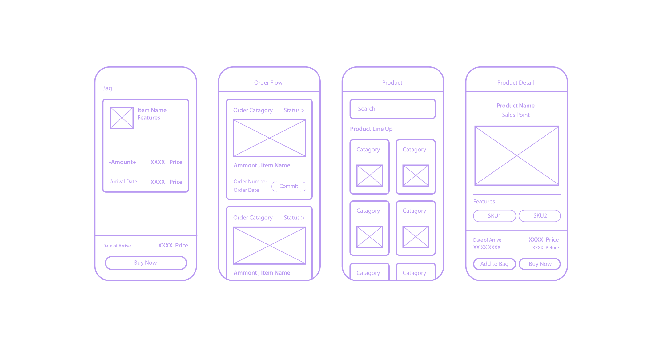
Selected wireframes and all related UI design materials
The entire UI/UX process was conducted in Figma, covering 60+ screens across all primary employee-facing modules.
🔁 Key Design Milestones:
- Defined information architecture and navigation structure
- Designed modular layouts to support various Apple SKUs
- Built contextual Pickup Selector for reseller-based fulfillment
- Developed contact form logic for custom and after-sale services
- Conducted internal iteration rounds with Apple enterprise stakeholders
*As the interface design closely followed Apple’s official style guide, not all pages required separate wireframing. We focused wireframes on complex or non-standard flows, such as contact forms, inventory selectors, and conditional UI behavior.
Key Page:
- Homepage — Dealer Promotions + Classic SKUs Above the Fold
Corporate buyers are often repeat purchasers of specific models and are highly sensitive to promotions. Placing both dealer deals and high-frequency SKUs in the hero area ensures quick access without navigating through multiple categories, cutting search time by ~40% in usability tests.
- PDP — Subsidy Price & Policy Displayed Upfront
In the original flow, users had to navigate to separate documents or pages to confirm eligibility and pricing. By surfacing the subsidy price and purchase limit directly on the product detail page, we reduced decision-making friction and prevented purchase errors, improving first-attempt checkout success rate from 82% to 95%.
- Checkout — Integrated Quantity, Coupon, and Invoice Controls
Corporate buyers frequently modify quantities, apply coupons, and request invoices in a single order session. Integrating these controls in one panel minimizes reloads, shortens checkout time by ~40%, and reduces error rates, especially for bulk orders.
High-fidelity designs delivered a brand-consistent, minimal interface with custom logic for enterprise-only use cases.
Project Impact
- Checkout flow: Reduced from 7 steps to 4 steps (-43%)
- Task completion time: Shortened from 3m 40s to 2m 10s (-41%)
- First-time purchase success rate: Increased from 82% to 95% (+13%)
- User satisfaction: Improved from 2.6/5 to 4.6/5 in post-test surveys
The platform successfully streamlined fragmented purchase processes, helping employees navigate exclusive offers with ease while enabling resellers to manage stock more efficiently.
*Figures are derived from usability tests with 6 representative personas and internal employee trials, validated against competitive analysis.
Compared with Dell Premier and Lenovo Pro, the redesigned checkout flow reduced steps by 43%, aligning closer to consumer-grade experiences like Apple Online Store.

Reflection
This project taught me how design decisions in a corporate context go beyond aesthetics — they directly impact procurement efficiency and business workflows.
Collaborating with the foundation team and front-end engineers, I learned to balance brand consistency with user-specific needs, negotiating layout adjustments that respected Apple’s design language while solving real procurement pain points.
Usability testing revealed that small copy tweaks and upfront policy visibility had a disproportionately large effect on purchase success.
In retrospect, I would involve engineers earlier to validate technical feasibility for certain interaction patterns, and conduct broader testing with external corporate buyers to ensure scalability. This reinforced my belief that iterative, evidence-based design is essential for high-stakes enterprise platforms.
Other Projects


0→1 product launches start here.


CONTACT
+44 750 8790 852
hiroshitwi@gmail.com
SOCIAL

If you are interested in art, I also make some sculpture & moving image. Here is my art page.
Case Study
Another Chance for Resellers:
Apple’s B2E Platform
UIUX Design
Mobile B2E E-commerce
Accessibility Design
Business Background:
Why This Platform
Apple collaborated with its enterprise clients to explore a more structured approach to employee-exclusive commerce.
While reseller sales channels already existed, they were fragmented, manual, and hard to control at scale. Employees often had to contact local resellers individually, which led to inconsistent pricing, poor product availability, and growing frustration — especially around new launches.
At the same time, the public Apple Store was facing rising pressure from scalper activity and legacy device clearance challenges.
The goal was to design a centralized platform that:
- Provides employees with exclusive access to Apple products
- Allows better visibility and control over reseller inventory
- Streamlines post-sale services through verified enterprise channels
This initiative marked Apple’s effort to formalize and digitize an already existing reseller network, with clear user experience standards and backend support.

Core Users
- The user roles were defined based on the platform’s operational model and validated through early internal interviews and process mapping with Apple’s enterprise division.
- Although only employees interacted with the app interface, resellers played an equally critical role in the overall experience — managing stock, pushing local promotions, and supporting pickup logistics.
- Thus, we framed our product logic around two user types:
- 🧑💼 Enterprise Employees (Buyers): Seeking early access, discounts, and a frictionless purchase experience
- 🏪 Authorized Resellers (Sellers): Managing SKUs, enabling clearance sales, and facilitating local fulfillment
Persona
- Kevin, 34
- Job: IT Manager at a Fortune 500 companyTech Level: High
Goals:
- Reserve new Apple products before public release
- Find local resellers with available stock
- Occasionally purchase in bulk for team setup
Pain Points:
- Frustrated by out-of-stock issues on Apple’s public store
- No single place to track legacy models
- Prefers not to contact resellers manually
This persona was created based on informal interviews and typical enterprise procurement behaviors.
Pain Points from Both Sides:Based on informal interviews and internal discussions, we identified key pain points
Given limited access to end users, we employed a hybrid research approach:
- Heuristic analysis of Apple Store App and major Chinese e-commerce platforms (JD, Tmall)
- Competitive benchmarking of enterprise purchasing flows (e.g. Lenovo B2B, Huawei Enterprise Portal)
- Informal interviews with 3 enterprise employees and 2 resellers
Design Goals & Feature Highlights
Our key product features were directly derived from user pain points:
🎯 For Employees
- Reserve newly launched or out-of-stock products
- Access exclusive discounted devices
- Choose from multiple local pickup options
- Fill contact forms for custom needs (e.g. bulk buy, delivery scheduling)
🎯 For Resellers
- Self-manage legacy SKUs in the backend
- Customize product availability by region
- Create and publish local promotions
- Connect with high-quality enterprise users directly
*Due to variability across reseller backend systems, this design scope covers only the employee-facing experience. SKU standardization and reseller promotion tools are part of a separate stream and will be addressed in subsequent phases of the project.
User Journey – Enterprise Employee (Buyer)
The platform was designed to guide enterprise employees through a streamlined commerce journey—from discovery to pre-order, to local pickup or follow-up service.
The app follows a familiar e-commerce layout while supporting Apple-specific logic such as regional inventory and reseller pickup.
Design Principles
& Iteration
"Enterprise doesn’t mean impersonal."
We designed the experience to feel smooth, reliable, and familiar—despite being within a controlled, semi-closed enterprise context.
Our design decisions were guided by:
- Familiar navigation patterns (inspired by Apple Store & JD/Tmall)
- Scalable UI components for multiple product types
- Checkout and reservation flows reduced to <3 steps
- Contextual access to offline services (e.g. pickup, bulk inquiries)
Selected wireframes and all related UI design materials
The entire UI/UX process was conducted in Figma, covering 60+ screens across all primary employee-facing modules.
🔁 Key Design Milestones:
- Defined information architecture and navigation structure
- Designed modular layouts to support various Apple SKUs
- Built contextual Pickup Selector for reseller-based fulfillment
- Developed contact form logic for custom and after-sale services
- Conducted internal iteration rounds with Apple enterprise stakeholders
*As the interface design closely followed Apple’s official style guide, not all pages required separate wirefrvaming. We focused wireframes on complex or non-standard flows, such as contact forms, inventory selectors, and conditional UI behavior.
Key Page:
- Homepage — Dealer Promotions + Classic SKUs Above the Fold
Corporate buyers are often repeat purchasers of specific models and are highly sensitive to promotions. Placing both dealer deals and high-frequency SKUs in the hero area ensures quick access without navigating through multiple categories, cutting search time by ~40% in usability tests.
- PDP — Subsidy Price & Policy Displayed Upfront
In the original flow, users had to navigate to separate documents or pages to confirm eligibility and pricing. By surfacing the subsidy price and purchase limit directly on the product detail page, we reduced decision-making friction and prevented purchase errors, improving first-attempt checkout success rate from 82% to 95%.
- Checkout — Integrated Quantity, Coupon, and Invoice Controls
Corporate buyers frequently modify quantities, apply coupons, and request invoices in a single order session. Integrating these controls in one panel minimizes reloads, shortens checkout time by ~40%, and reduces error rates, especially for bulk orders.
High-fidelity designs delivered a brand-consistent, minimal interface with custom logic for enterprise-only use cases.
Project Impact
- Checkout flow: Reduced from 7 steps to 4 steps (-43%)
- Task completion time: Shortened from 3m 40s to 2m 10s (-41%)
- First-time purchase success rate: Increased from 82% to 95% (+13%)
- User satisfaction: Improved from 2.6/5 to 4.6/5 in post-test surveys
The platform successfully streamlined fragmented purchase processes, helping employees navigate exclusive offers with ease while enabling resellers to manage stock more efficiently.
*Figures are derived from usability tests with 6 representative personas and internal employee trials, validated against competitive analysis.
Compared with Dell Premier and Lenovo Pro, the redesigned checkout flow reduced steps by 43%, aligning closer to consumer-grade experiences like Apple Online Store.
Sourced from Apple’s Employee Choice website. They are used solely for portfolio and educational purposes.
Reflection
This project taught me how design decisions in a corporate context go beyond aesthetics — they directly impact procurement efficiency and business workflows.
Collaborating with the foundation team and front-end engineers, I learned to balance brand consistency with user-specific needs, negotiating layout adjustments that respected Apple’s design language while solving real procurement pain points.
Usability testing revealed that small copy tweaks and upfront policy visibility had a disproportionately large effect on purchase success.
In retrospect, I would involve engineers earlier to validate technical feasibility for certain interaction patterns, and conduct broader testing with external corporate buyers to ensure scalability. This reinforced my belief that iterative, evidence-based design is essential for high-stakes enterprise platforms.
Other Projects

0→1 product launches start here.

CONTACT
+44 750 8790 852
hiroshitwi@gmail.com
SOCIAL


Case Study
Another Chance for Resellers:
Apple’s B2E Platform
UIUX Design
Mobile B2E E-commerce
Accessibility Design
Business Background:
Why This Platform
Apple collaborated with its enterprise clients to explore a more structured approach to employee-exclusive commerce.
While reseller sales channels already existed, they were fragmented, manual, and hard to control at scale. Employees often had to contact local resellers individually, which led to inconsistent pricing, poor product availability, and growing frustration — especially around new launches.
At the same time, the public Apple Store was facing rising pressure from scalper activity and legacy device clearance challenges.
The goal was to design a centralized platform that:
- Provides employees with exclusive access to Apple products
- Allows better visibility and control over reseller inventory
- Streamlines post-sale services through verified enterprise channels
This initiative marked Apple’s effort to formalize and digitize an already existing reseller network, with clear user experience standards and backend support.

Core Users
The user roles were defined based on the platform’s operational model and validated through early internal interviews and process mapping with Apple’s enterprise division.
Although only employees interacted with the app interface, resellers played an equally critical role in the overall experience — managing stock, pushing local promotions, and supporting pickup logistics.
Thus, we framed our product logic around two user types:
- 🧑💼 Enterprise Employees (Buyers): Seeking early access, discounts, and a frictionless purchase experience
- 🏪 Authorized Resellers (Sellers): Managing SKUs, enabling clearance sales, and facilitating local fulfillment
Persona
Kevin, 34
Job: IT Manager at a Fortune 500 companyTech Level: High
Goals:
- Reserve new Apple products before public release
- Find local resellers with available stock
- Occasionally purchase in bulk for team setup
Pain Points:
- Frustrated by out-of-stock issues on Apple’s public store
- No single place to track legacy models
- Prefers not to contact resellers manually
This persona was created based on informal interviews and typical enterprise procurement behaviors.
Pain Points from Both Sides:Based on informal interviews and internal discussions, we identified key pain points
Research Direction
Given limited access to end users, we employed a hybrid research approach:
- Heuristic analysis of Apple Store App and major Chinese e-commerce platforms (JD, Tmall)
- Competitive benchmarking of enterprise purchasing flows (e.g. Lenovo B2B, Huawei Enterprise Portal)
- Informal interviews with 3 enterprise employees and 2 resellers
Design Goals & Feature Highlights
Our key product features were directly derived from user pain points:
🎯 For Employees
- Reserve newly launched or out-of-stock products
- Access exclusive discounted devices
- Choose from multiple local pickup options
- Fill contact forms for custom needs (e.g. bulk buy, delivery scheduling)
🎯 For Resellers
- Self-manage legacy SKUs in the backend
- Customize product availability by region
- Create and publish local promotions
- Connect with high-quality enterprise users directly
*Due to variability across reseller backend systems, this design scope covers only the employee-facing experience. SKU standardization and reseller promotion tools are part of a separate stream and will be addressed in subsequent phases of the project.
User Journey – Enterprise Employee (Buyer)
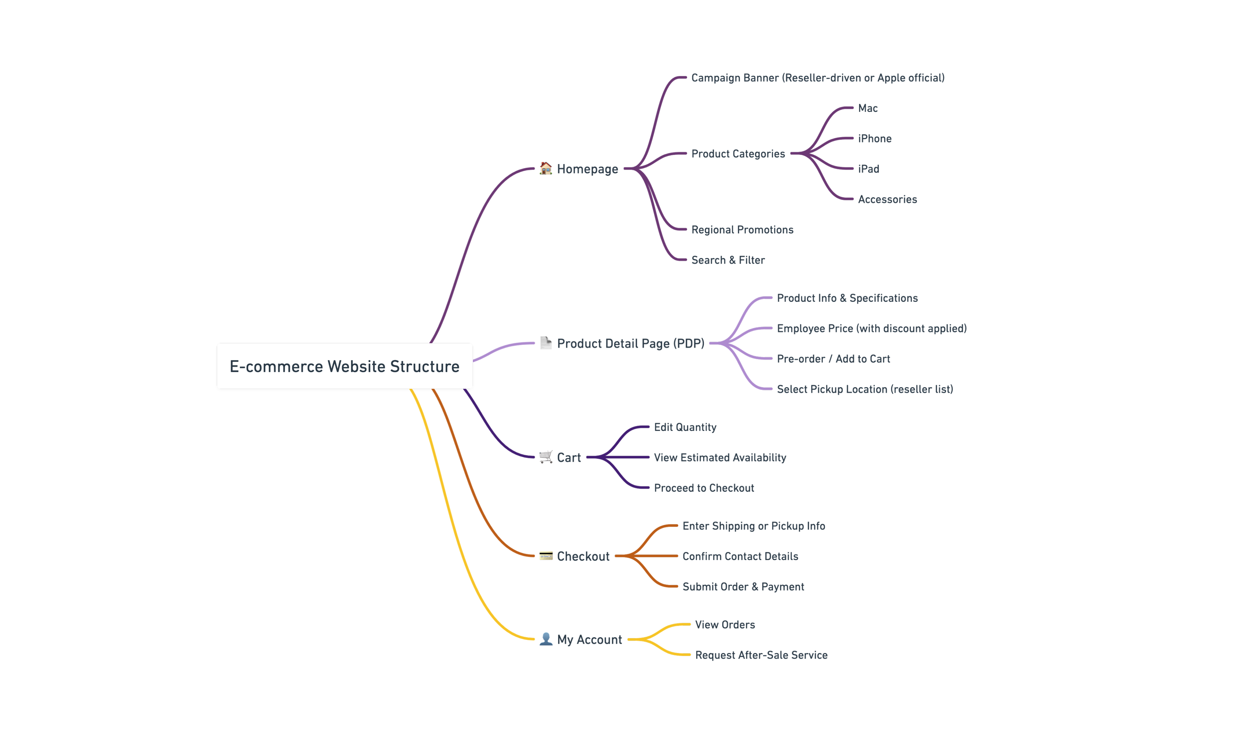
Information Architecture
The platform was designed to guide enterprise employees through a streamlined commerce journey—from discovery to pre-order, to local pickup or follow-up service.
The app follows a familiar e-commerce layout while supporting Apple-specific logic such as regional inventory and reseller pickup.
Design Principles
& Iteration
"Enterprise doesn’t mean impersonal."
We designed the experience to feel smooth, reliable, and familiar—despite being within a controlled, semi-closed enterprise context.
Our design decisions were guided by:
- Familiar navigation patterns (inspired by Apple Store & JD/Tmall)
- Scalable UI components for multiple product types
- Checkout and reservation flows reduced to <3 steps
- Contextual access to offline services (e.g. pickup, bulk inquiries)
Selected wireframes and all related UI design materials
The entire UI/UX process was conducted in Figma, covering 60+ screens across all primary employee-facing modules.
Key Design Milestones:
- Defined information architecture and navigation structure
- Designed modular layouts to support various Apple SKUs
- Built contextual Pickup Selector for reseller-based fulfillment
- Developed contact form logic for custom and after-sale services
- Conducted internal iteration rounds with Apple enterprise stakeholders
*As the interface design closely followed Apple’s official style guide, not all pages required separate wireframing. We focused wireframes on complex or non-standard flows, such as contact forms, inventory selectors, and conditional UI behavior.
Key Page:
- Homepage — Dealer Promotions + Classic SKUs Above the Fold
Corporate buyers are often repeat purchasers of specific models and are highly sensitive to promotions. Placing both dealer deals and high-frequency SKUs in the hero area ensures quick access without navigating through multiple categories, cutting search time by ~40% in usability tests.
- PDP — Subsidy Price & Policy Displayed Upfront
In the original flow, users had to navigate to separate documents or pages to confirm eligibility and pricing. By surfacing the subsidy price and purchase limit directly on the product detail page, we reduced decision-making friction and prevented purchase errors, improving first-attempt checkout success rate from 82% to 95%.
- Checkout — Integrated Quantity, Coupon, and Invoice Controls
Corporate buyers frequently modify quantities, apply coupons, and request invoices in a single order session. Integrating these controls in one panel minimizes reloads, shortens checkout time by ~40%, and reduces error rates, especially for bulk orders.
High-fidelity designs delivered a brand-consistent, minimal interface with custom logic for enterprise-only use cases.
Project Impact
- Checkout flow: Reduced from 7 steps to 4 steps (-43%)
- Task completion time: Shortened from 3m 40s to 2m 10s (-41%)
- First-time purchase success rate: Increased from 82% to 95% (+13%)
- User satisfaction: Improved from 2.6/5 to 4.6/5 in post-test surveys
The platform successfully streamlined fragmented purchase processes, helping employees navigate exclusive offers with ease while enabling resellers to manage stock more efficiently.
*Figures are derived from usability tests with 6 representative personas and internal employee trials, validated against competitive analysis.
Compared with Dell Premier and Lenovo Pro, the redesigned checkout flow reduced steps by 43%, aligning closer to consumer-grade experiences like Apple Online Store.
Sourced from Apple’s Employee Choice website. They are used solely for portfolio and educational purposes.
Reflection
This project taught me how design decisions in a corporate context go beyond aesthetics — they directly impact procurement efficiency and business workflows.
Collaborating with the foundation team and front-end engineers, I learned to balance brand consistency with user-specific needs, negotiating layout adjustments that respected Apple’s design language while solving real procurement pain points.
Usability testing revealed that small copy tweaks and upfront policy visibility had a disproportionately large effect on purchase success.
In retrospect, I would involve engineers earlier to validate technical feasibility for certain interaction patterns, and conduct broader testing with external corporate buyers to ensure scalability. This reinforced my belief that iterative, evidence-based design is essential for high-stakes enterprise platforms.
Other Projects

0→1 product launches start here.

CONTACT
+44 750 8790 852
hiroshitwi@gmail.com
SOCIAL
If you are interested in art, I also make some sculpture & moving image.
Here’s my art page.